Let me preface everything I’m about to write by saying this: I am not a designer. I enjoy design, but I tend to hack away at it a bit. Actually I’ve gone a bit to and from in my career moving from pure code roles to front end roles to web roles where you kind of need a bit of everything, and that’s probably where I’m most comfortable now. So treat everything that followers as the designer-by-default comments of a developer :)
Fixed or variable
No, not interest rates, web page layouts. Somewhere in the design process you need to make a call on whether you fix the width of the page at an arbitrary value or let it roam free out to whatever width the browser’s resolution supports. The former gives you certainty of how the page will flow, the latter maximises the available space.
As you’ll see on this here blog, I’ve fixed the width. I’ve followed the philosophy of the 960 grid system which means that on a 1024 x 768 res machine (a reasonable accepted minimum), I’ve left plenty of room for other stuff that occupies the horizontal plane (namely scroll bars and window chrome) plus it divides down nicely into round numbers (evenly divisible by 2, 3, 4, 5 and 6). This is all very handy once you want to start splitting things into columns.
But it also means there can be a lot of wasted space when the browser scales out to higher resolutions. For example, running at 1920 x 1080:
The reason I chose this pattern for troyhunt.com is that it gave me a lot of predictability when embedding imagery in posts. For example, I can easily position an image such that it floats to the side of some text and occupies the same amount of vertical space regardless of the browser resolution. Having said that, reading a post from the RSS feed or through a service like Instapaper sort of throws all that out the window anyway. More on that later.
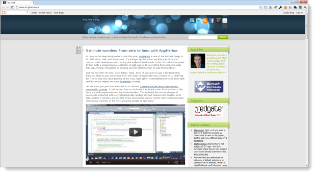
Another angle is to take a leaf out of Scott Hanselman’s blog which was recently redesigned by a real live designer; I mean someone who is a proper designer, not a ring-in:
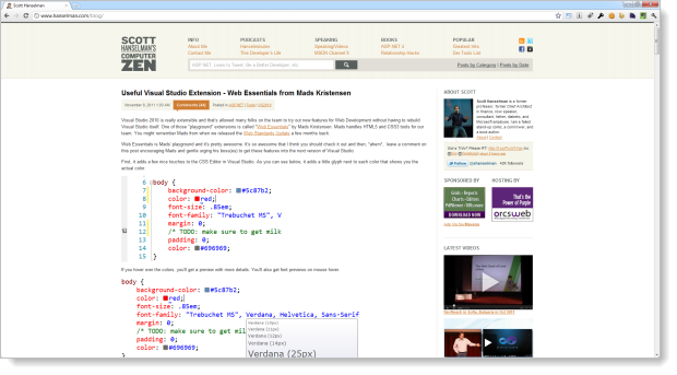
This looks pretty straight forward at big res (and it still has lots of whitespace), but as it scales down, features are actually disabled. See what happens with the sidebar on the right once the res comes right down:
For ASafaWeb, content is king. What’s more important than anything in this site is communicating the message of the scan results; what has been done, what the result was and if necessary, how to fix it. The content is also dynamic in that there are many, many different possible combinations of a scan result which means there’s a lot of variance in terms of how the content might flow. That’s why I initially set out to make everything variable.
The reason I didn’t end up sticking with variable width is simply this: it looks crap. The problem is you get someone with plenty of horizontal space and you quickly end up with very long lines of text which are quite frankly, legibility nightmares (I suspect this may also be why Scott capped his horizontal width at a max limit). Anything more than about 1,000 pixels (a pretty low bar) and you’ve got problems. There’s a good reason why when you look at beautiful web design, you will almost certainly find everything fixed somewhere south of 1,000 pixels wide.
Here are some good aggregated examples:
- 50+ Beautiful Websites with Great Colour Schemes
- 74 Fresh Examples Of Beautiful Single Page Website Designs
- 50 Beautiful CSS-Based Web-Designs
Not much fixing going on there…
Typography
Oh boy, here’s a hell of a topic. Firstly, I may unintentionally (or unknowingly) interchange the words “typeface” and “font”. You see, they’re (very slightly semantically) different beasts and there are those amongst us who take pleasure from pointing out that you (or me, in this case), don’t know the difference. Should I make this mistake, let me refer you to the heading titled “F*** you designer snob” in the aforementioned link – you know damn well what I mean!
With that behind us, let’s move on. If you think typography involves nothing more than choosing a type from a list, have a listen to the latest This Developer’s Life and you’ll start to get an idea of how much goes into this topic (and how passionate people can get about it).
Let’s begin with the basics; this is sans serif font:
And this is a font with serifs:

Serifs are the little guys in red which decorate some of the pointy bits:

You’ll see serif based fonts used a lot in print media and they apparently show readability improvements (something about the serifs establishing a hard baseline which helps the eye identify lines). However, serifs don’t tend to work as well on PCs because our screens have such low resolution that they struggle to cleanly render the fine details of the serif. For example, you’d typically print at somewhere in the order of 300 DPI and upwards yet most screens are more in the range of 100 DPI. A good exception is a device like an iPhone 4 which can do 326 DPI, but of course as with everything web, you’re designing for the masses which means you need to assume a low DPI.
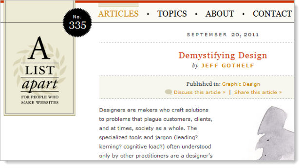
Bottom line: fonts with serifs don’t work well for paragraphs of text on the web. However, they’re ok for larger point size and smaller blocks of text such as headings. There are many examples of designer-focussed websites taking this approach. For example, A List Apart:
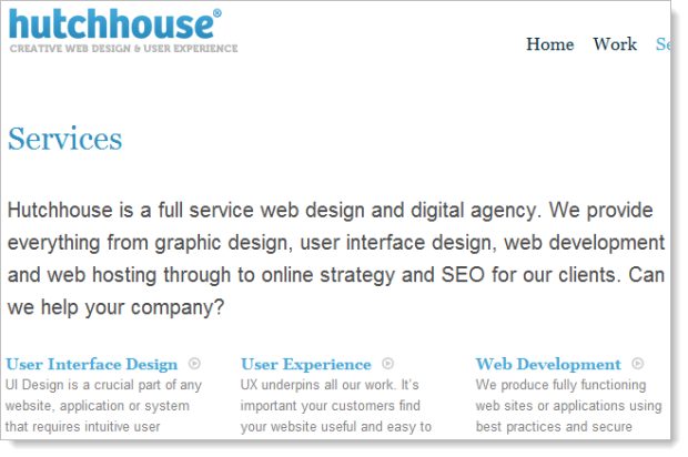
Or Hutchhouse:
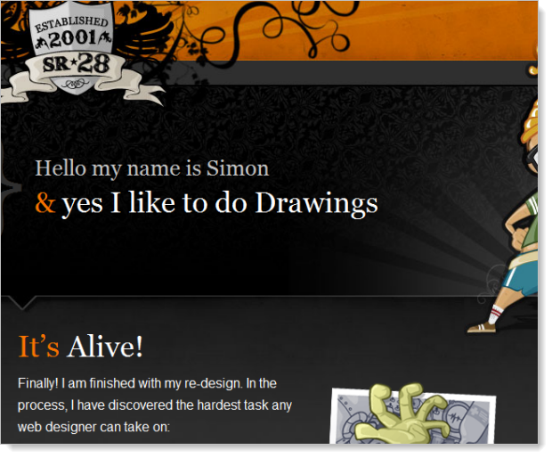
Or SR28.com:
You then have typefaces which were explicitly designed to be used on a computer screen, for example, Verdana:
Verdana was designed to be readable at small sizes on a computer screen. The lack of serifs, large x-height, wide proportions, loose letter-spacing, large counters, and emphasized distinctions between similarly-shaped characters are chosen to increase legibility.
Interestingly, there appears to be quite a bit of designer-hate for poor old Verdana. Perhaps it’s because of its Microsoft roots (the design comes from Redmond), or perhaps as some say, it’s simply because the font is comparatively larger – too large – compared to other typefaces (this, of course, is easily rectifiable). Ironically, that previous link uses a serif font for body text which is considered a bit of a no-no. As I alluded to earlier, typography is a crazy and confusing world!
But you can’t escape the fact that Verdana was designed with the express purpose of making text read well on the screen which from a usability perspective, gives it a rather big tick. In fact Jakob Nielsen uses it exclusively on useit.com and it’s hard to find a more authoritative source on the science of making websites usable than this guy.
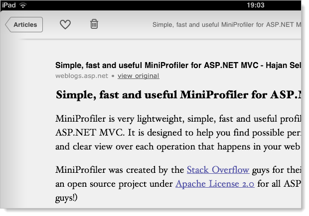
Look, ultimately the designer space is full of typography faux pas. Here’s a perfect example: Instapaper is considered a most excellent way of reading online material in a more succinct, legible fashion. So what type does Instapaper on the iPad – a 132 DPI device – choose?
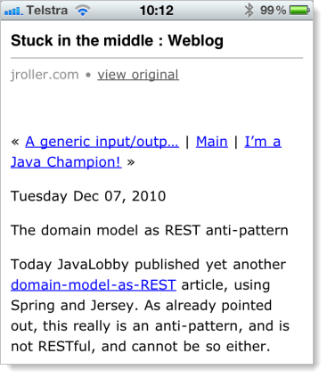
And how about on the iPhone 4 with that beautiful 326 DPI retina display:
Grains of salt people, grains of salt.
Expecting the unexpected
The other thing to consider with both content flow on the screen and typography is that they’re both highly variable. I don’t mean because of screen resolution, we all know that already, I mean because it gets used in unexpected ways.
People changing font sizes, Instapaper, RSS, print mode; it’s all over the place. Making assumptions about pixel perfect placement of design against content is a fool’s errand and you’ll come undone pretty quickly doing this.
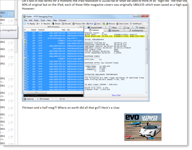
Here’s a perfect example of where it goes wrong: recently I wrote about Secret iOS business and as I usually do, I centred smaller images on the page but for the big fellas which filled out the entire 620 pixels of available space, I just dropped them in. You can see the grey borders either side of it which means it’s filled out to the edges:
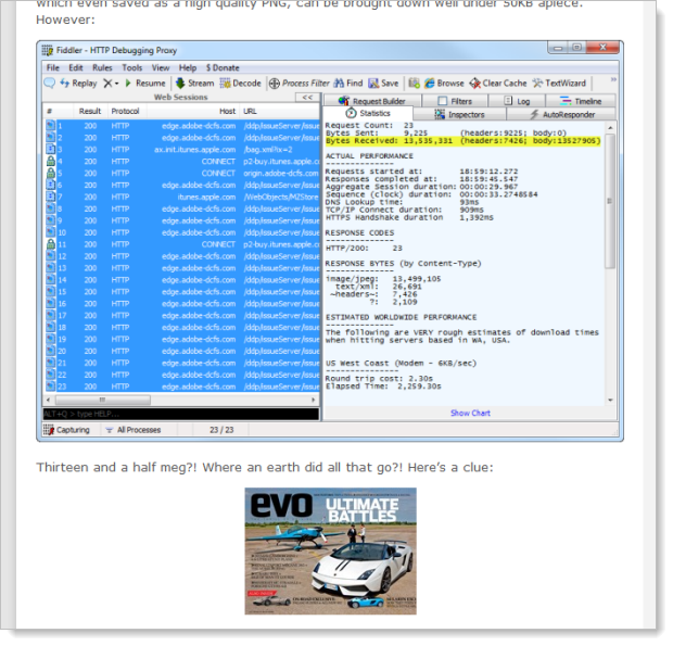
After all, it doesn’t matter if an image which takes up all the horizontal space is aligned to the left, the right or the centre, does it? Well, actually, it does:
In this case, my Outlook RSS reader has defaulted the alignment of the top image to the left (what you’d expect with no explicit alignment) and set the bottom one in the centre. So images with no explicit alignment will always sit to the left, right? Uh:
It seems that Instapaper has a penchant for putting everything in the centre! And that’s just fine in this context, but the point is that you’ve got to expect your website to be used in all sorts of ways you probably haven’t expected – many of which don’t even exist yet – and you can’t be too precious about things like content alignment. Instead, you’ve got to design such that content will natively flow within the boundaries of the device / app / widget it gets dropped into.
Expect the site to be viewed in ways you don’t expect.
Summary
This boils down to a few key principles for ASafaWeb:
- Fix the page width. All the cool sites are doing it and it’s very, very hard to create a cohesive design without doing so.
- Stop worrying about bloody fonts. There are a lot of opinions, a lot of contradictions and quite frankly, if it looks good and works consistently, I’m doing it.
- Don’t get precious about layout. There are so many different ways this site might be used the main thing is to focus on compatibility of features rather than pixel-perfect representation in every scenario.
Of course I have the luxury of setting my own boundaries on this; I’m both the customer and the developer and as such I get to decide the balance of usability versus design versus features versus what’s simply practical. It’s a rare opportunity for me to enjoy such freedom and I’m going to make the most of it :)