With the private beta testing of ASafaWeb having gone quite nicely and a good whack of time then dedicated to both fixing stuff and implementing new features, it’s time to do something about this ugly duckling. I truly believe that the user experience is an absolutely fundamental factor in the success of a site and it really deserves some serious attention so rather than just hack it out, I’m going to approach it quite methodically and write about it as I go.
Here’s the story of ASafaWeb’s emergence from UX mediocrity to what will hopefully become a cohesive, engaging design.
I know what I like
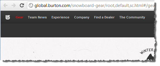
A fair bit of work had already gone into the function of ASafaWeb before I got around to the design. This gave me plenty of time to think about what I liked and I started capturing these ideas in Evernote pretty much from day one. Often this was little things, for example, I like the way Burton has such a discrete navigation:
I also like how Vinomofo gives depth and character to otherwise boring input boxes:

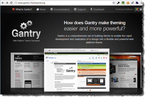
And I really like the way Gantry uses greyscale to contrast against the colourful content:
There are many other similar examples of this, the point I’m making is that I had some sense of where I wanted to take this design.
Not such a bad starting point
ASafaWeb was built from the ground up as a brand new MVC 3 project. This meant it got lots of UI goodness right out of the box; page layouts, CSS styles, validation – it’s all there from the get-go. This is a really good starting point for a project like ASafaWeb because it means you can get up and building real functionality right away without worrying about the basics of layout.
I’m sure many people will bemoan the default template but it actually has a lot going for it:
- It’s entirely CSS based layouts (no evil table based layouts here!)
- It comes up well against the W3C validation services (some minor CSS issues).
- It plays well across various resolutions.
- It works just fine on other devices (at least it does on iOS devices).
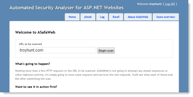
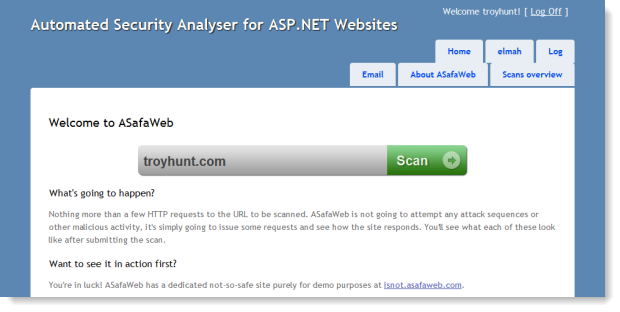
What all this meant is that whilst not visually elegant, ASafaWeb was functional without any design input whatsoever on my behalf:
Photoshop-first versus markup-first
There seems to be a bit of debate – dare I say “religious” debate – over where design should begin. Do you take the traditionalist designer-centric approach and Photoshop everything up then slice it and reassemble it into HTML or do you begin by being markup-centric and build your design directly via HTML and CSS?
Religious debates don’t generally tend be very objective or productive and certainly I’ve gone down both the above routes many times before. They each have their strengths and weaknesses and frankly I think it’s very much a factor of who’s involved in the project and where their strengths lie. If I had access to an uber-designer who knew their Photoshop stuff but couldn’t translate it to markup then I’d be quite happy to take their work and slice it up myself.
I’m pretty comfortable with either model but given ASafaWeb is already based on the MVC 3 template which has the fundamental layout in place already plus includes hundreds of existing lines of CSS, it will be markup-first for me. Photoshop will still feature, but it’s for little pieces of bespoke work as opposed the laying the whole thing out from scratch.
CSS reset courtesy of Eric Meyer
A good first port of call before delving into the intricacies of the various browser behaviours is to apply a CSS reset. The idea is that different browsers will display various inconsistencies in the way they render elements and the role of the CSS reset is to bring them all down to a common baseline before you start messing around with things. There are a few different resets out there but popular opinions favours Eric Meyer’s version.
What this boils down to is a block of CSS you can chuck into your existing style sheet right up the top before anything else further down starts redefining things. This will change some default behaviours and after the reset things looked a little different:
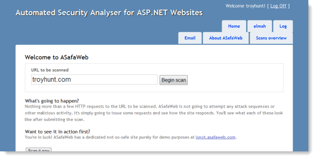
In this case, the reset has shuffled the navigation onto two lines and also changed the height and weight of the headings. No biggie, these can all be tweaked further down in the CSS directly on the elements affected by the reset, namely the h2 and li definitions. The important thing is that there’s now a good baseline to work from.
A starting point
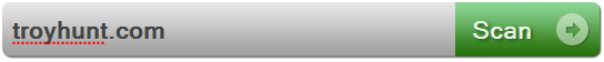
It can be a little difficult to even know where to begin with this sort of thing, but I actually had a clear goal in mind; I wanted the URL text box to be the focal point of the page. This is the entry point to any scan so it needed to be loud and clear. I also wanted to give it depth. Form controls tend to be very two-dimensional and a little boring and they just don’t need to be.
But before I even started thinking about text boxes and buttons, I already had an overall theme in mind. I wanted something dark and textured where contrasting page elements with richer colours could jump off the page and really stand out, almost as if the results were emerging from the dark underbelly of the security world (alright, starting to get a bit marketing-speak here!)
So I rendered up backgrounds for the text box and button then created an image to sit up against the left of everything to give it a curved finish. This means the text box itself can scale out horizontally depending on the available resolution (more on that later). All the images are transparent PNGs so whatever background colours or patterns I decide on can happily sit under these without any funky anti-aliasing problems.
The other thing I did was to override some of those CSS resets, namely to get some margin back around the headings. The nav can wait – it’s going to be positioned quite differently anyway. Here’s how it’s looking:
With the emergence of so many new mobile browsers and other devices that are now web-browser enabled, I wanted to keep the markup as true to the semantic intent of the controls as possible. Take the “Scan” button as an example: it would have been easy to just use an image for the whole thing but instead, the markup is just as you’d expect from a submit button:
<input type="submit" value="Scan" />
The CSS is inherited from the container it sits within (a fieldset tag with a custom CSS class) and the “Scan” text is the actual text from the control, it’s not part of the bitmap.
Here’s where we also start having the power struggle between browsers and their respective implementations of CSS. Take the two images below which I’ve screen-grabbed from Chrome 14 on the left and IE 9 on the right then blown up about 250%. There are two interesting differences here:


Firstly, IE 9 has done a significantly better job of the anti-aliasing. Thank you very much ClearType, nice work! This is also discernible at the original size, but you need to consciously look for it. Incidentally, the last episode of This Developer’s Life has some very interesting background on ClearType.
The other thing is that Chrome has implemented a nice little drop-shadow under the text whereas IE hasn’t. This has been achieved by the text-shadow CSS property as follows:
text-shadow: 2px 2px 3px #2f6b1e;
Problem is, IE 9 doesn’t know what this is so doesn’t implement it. Now of course this isn’t exactly a breaking change but it does illustrate that we’re still dealing with browser idiosyncrasies. This is just one of those CSS behaviours where some browsers implemented it six years ago yet others still refuse to. Part of it is inevitably that it wasn’t part of the CSS 2.x spec, a fact that Visual Studio is happy to remind you of:
In theory, this should form part of the CSS 3 spec but then even after installing the CSS 3 Intellisense Schema it still wasn’t real happy:
The situation is made all the more odd by the default MVC 3 template implementing this property on the h1 tag:
So Microsoft implements a CSS property within the default template of their MVC framework but not within their browser! Like I said earlier, we’re still dealing with browser idiosyncrasies all these years later.
Continuous cross-browser and platform compatibility checking
The example of the text-shadow property above is just one of many instances where a particular browser or platform is going to do its own thing in deference to what all the others are doing. For this reason I wanted to make sure that every little feature is checked across browsers and platforms before moving on.
Mind you, I’m going to be selective. If it behaves well on all current browser versions on Windows 7 and on iOS devices (certainly the predominant mobile browser on troyhunt.com), that’s a fine starting point. My audience generally has both the capability and common sense to keep their browsers current! If people make me aware of issues on other browsers or platforms later on then I can address those in due course. The thing is though, at least as far as CSS goes, if a site plays nice by these criteria then it’s unlikely to be broken in any sort of functional way on any major browser and platform combination. Perhaps some alignment or formatting problems, but that’s usually the extent of it.
So here’s a good example: In Safari running on Windows 7, I get this:
In Safari on iOS, I get this:

I’m actually mostly ok with this; I don’t mind that the button separates itself from the text box by a pixel and rounds the corners; in isolation it actually looks ok. What I do mind is that the little rounded image on the left of the text box sticks out like, well, it just does. And then the text hits the left edge of the text box because the image hasn’t provided a visual extension to it. Not cool.
So the best way to tackle this one was to let to go of a repeating background allowing me to scale out the width of the box indefinitely and instead just use a single image with the curved end then pad the left of the box. Problem is, that means other compromises. For example, the repeating background plus curved end totalled less than 1KB but a whole non-repeating image for the background blows out to 8.6KB.
On the flipside, it’s only one HTTP request so you save a bit of wait time there (although the two images would have been a good sprite candidate). Plus it kills an explicit image tag which was only there for aesthetic purposes so the markup is cleaner. There you go, talked myself into it :)
The end result is identical UX to before on the PC and a nice representation in iOS:

Incidentally, even Safari on iOS can get those text-shadow properties right – c’mon IE!
All of the iOS testing above was on iPad but it’s also working out pretty well on the iPhone in so far as it’s functional, although obviously small (don’t read too much into my choice of port!):
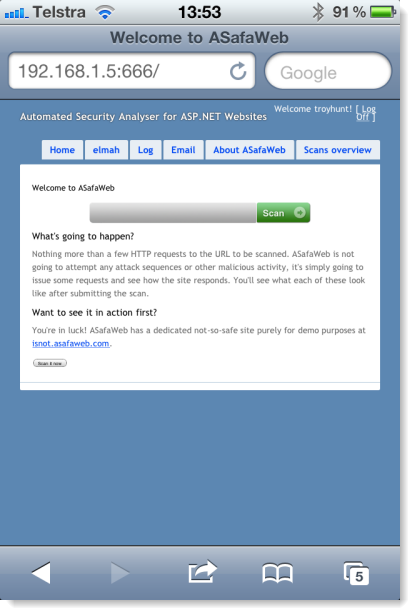
I really don’t want to be forced into creating a mobile version as well. It may happen and the more dependent I am on CSS, the easier it will be. But I want the choice; I want to be able to choose between a fully functional albeit second class experience on the phone and a richer experience dedicated to the smaller form factor.
Summary
This is a basic start but I always find design is one of those things where you just need a starting point then everything starts to evolve from there. Setting out with the CSS reset is a good bit of insurance as is making sure everything still plays nice with the other browsers and platforms after each new feature is built. Taking little design-bites at a time within that default template is also proving to work well as everything still behaves nicely throughout the development.
Next up: navigation.