Let me start this post by acknowledging that firstly, I screwed up and that secondly, Virgin Blue were very helpful after the aforementioned screw up. But they’ve still got a major usability issue and it’s one we website folks often face: defaults.
Would you like fries with that?
The problem with booking airline flights is that they’re always trying to upsize you. Would you like to pay for baggage (remember when that used to be free)? Would you like to choose your seat (and pay for the privilege)? Would you like to offset your carbon footprint (yeah, right…)? Would you like to hire a car? Would you like accommodation at your destination? Would you like to join the rewards program? And finally, would you like to purchase travel insurance?
Problem is, by the time you’ve gone through all this – all well as the process you actually wanted to perform which was to find a flight and pay for it – you’ve waded through an awful large amount of crap:
Now I don’t have too much of a problem with this, it’s a minor speed bump in my otherwise expeditious ticket booking exercise and frankly, I just get into auto pilot mode. Don’t give me anything other than the flight, here’s my credit card, seeya later.
Defaults break your own free will
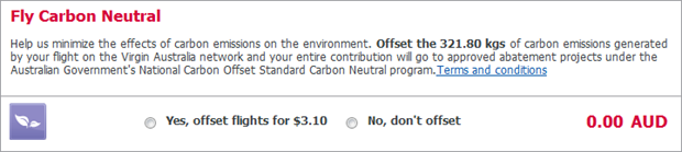
The problem I just had, however, is that Virgin Blue does a particularly nasty thing with one of their defaults; they take something most people will not want, give it to you by default and then charge you for it.

See what I mean? Take this little travel insurance panel, put it in the context of the laborious image further up and it disappears very quickly. But even so, it’s the default selection which is the real problem. Actually, it’s our native human behaviour which is the problem because the reality is that default selections have a massive influence over which option we ultimately choose.
The screwy thing about it is that Virgin Blue’s use of radio buttons and defaults isn’t even consistent:
Jakob Nielsen has a take on that:
Consistency is one of the most powerful usability principles: when things always behave the same, users don't have to worry about what will happen. Instead, they know what will happen based on earlier experience.
In fact while we’re there, he also has a position on radio buttons without defaults:
Always offer a default selection for radio button lists. By definition, radio buttons always have exactly one option selected, and you therefore shouldn't display them without a default selection.
And rightly so.
So why is the insurance default so alluring to Virgin? Easy; there’s a monetary incentive. How many people gloss right over options like that and never even realise they’ve been stung for something they didn’t want? The only way I found out was my wife – who is clearly more observant than I – querying why we needed it after I forwarded her the tickets. Virgin almost made a nice little earn out of me for doing absolutely nothing beyond setting a default.
The usability position on defaults is very straight forward and it’s simply this; defaults are fine if they aid people in accomplishing the task they set out to perform. If, for example, a postcode field is completed after entering my suburb, that’s helpful. Likewise if a default is used to clearly illustrate a commonly selected value which, under normal circumstances, you would expect someone to choose and they would be happy to accept without making a conscious decision, that’s also fine.
When you go and nest input controls amongst a sea of other info you could just as well be asking what shape the earth is and if you default it to “flat”, you’re gonna get a lot of old world answers. This is not a free will decision – it’s a product of a poorly chosen default.
I demanded satisfaction!
Ready for a rowdy confrontation where I would espouse my firmly held usability beliefs, I gave Virgin a call. Funnily enough, they (or rather their insurance provider, Allianz), has a cooling off period which means we can promptly get our cash back. Somehow I got the distinct feeling I wasn’t the first sucker person to be in this predicament…
So here’s a tip, Virgin; if you want to default something, default the “I agree to the terms and conditions checkbox”. Nobody reads those bloody things anyway.