Back in part 1 of Birth of a UX I talked about identifying styles that I liked, the head start the default MVC 3 template gives you, the eternal battle of Photoshop first versus CSS first, CSS resets then actually making a start on styling one central element of ASafaWeb and making it all play nice across browsers. And that was it – phew!
This time around it’s about debugging the markup, building the nav and then completely changing my mind about CSS resets. Well perhaps not completely, but rather understanding a little bit more about what “reset” really means and instead coming at it from a different angle by using a “normalisation” approach instead. It might sound a bit semantic, but there’s an important philosophical difference.
Speaking of semantics, we’ll also have a good look at what semantics mean in HTML markup. It’s a pretty important concept which is often misunderstood so I’ll give it a recap here.
Don’t leave home without Firebug
One tool any web developer worth their salt is intimately familiar with is Firebug. The IE 9 developer tools are actually very good too, but Firebug has five years and millions of users under its belt so it remains the tool most people immediately think of. Let’s see it in action.
One thing I wanted to do in ASafaWeb is to get the nav right up to the top of the page rather than sitting beneath the heading. Switching it around in the markup is easy enough, but there’s clearly more to do:
Now, I can start trawling through CSS and trying to manually figure out why it’s not sitting at the top of the page or I can fire up Firebug and have it tell me. All I need to do is highlight an HTML element in the source and I’ll see a visualisation of the element at the top and the CSS applied to it on the right:
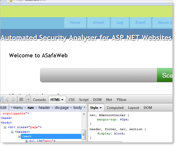
The turquoise highlight at the top of the image above shows the element that’s selected and the yellow band above it indicates margin. We can then see that same margin represented in the CSS in the bottom right of the image. It doesn’t get any easier than that!
Getting semantic
There’s a lot that goes into a nav. Sure, it might look like just a series of links, but there’s a lot more to it than that. To begin with, let’s take a look at the markup:
<header>
  <nav>
    <img src="../../Content/Images/SmallLogo.png" alt="ASafaWeb Logo" />
    <div id="logindisplay">
      <ul id="LogOn">
        <li><a href="/Account/LogOff">Log off troyhunt</a></li>
      </ul>
    </div>
    <ul id="menu">
      <li><a href="/">Home</a></li>
      <li><a href="/elmah.axd">elmah</a></li>
      <li><a href="/Log">Log</a></li>
      <li><a href="/Util/Email">Email</a></li>
      <li><a href="/Home/About">About ASafaWeb</a></li>
      <li><a href="/Home/Scans">Scans overview</a></li>
    </ul>
  </nav>
  <div id="title">
    <h1>Automated Security Analyser for ASP.NET Websites</h1>
  </div>
</header>
Don’t worry about the visual design yet, that’s inconsequential to the markup. There are a few noteworthy things in the markup above. To begin with, it’s not really my markup because for the most part, it’s just what you get in the default ASP.NET MVC 3 template. What’s nice about it is that it’s semantically correct. Here’s what I mean by that:
Semantic HTML, or "semantically-correct HTML", is HTML where the tags used to structure content are selected and applied appropriately to the meaning of the content.
This is from the Introduction to Semantic HTML post over on the Web Design from Scratch website and what its saying is that HTML tags actually have meaning. So let’s look back up at the markup above and in particular two tags which may appear quite new to you:
- The header element represents a group of introductory or navigational aids.
- The nav element represents a section of a page that links to other pages or to parts within the page.
Ok, this sounds pretty self-explanatory, but that’s the whole point! HTML 5 has not only given us a bunch of new functional features, it also provides a lot of new semantics. And it doesn’t matter if an older browser doesn’t understand the semantic intent; it will just render the content and apply any pre-defined CSS presets against it. Nice.
The other thing is – and we’re still on semantics here – is that the links appear as list items within an unordered list. Why? Because that’s precisely what a nav is – a series of links in which the order is (usually) unimportant. Sure, we could just throw a bunch of hyperlink tags at the page but this doesn’t imply intent.
So think about what just the markup is telling us, and not only us, but the browser as well; we know there’s a header which implies that this isn’t really body content, rather something that just kicks the page of. We know that within there we can find some navigation and that the order of it isn’t important. Finally, we know that there are a series of items with links inside that navigation. We can tell all this without seeing any browser rendering because the markup tells us this via its semantic intent.
But it’s not just HTML 5 that implies semantic intent, here’s another classic example: italics text. The idea of semantic HTML is to describe intent rather than visual implementation. The grammatical intent of italics text is to provide emphasis – italics is actually just the visual representation of that. What this means is that an <i> tag is really improper usage and you should instead use an <em> tag. Likewise a <b> tag should be replaced for a <strong> tag as it describes intent rather than visualisation. There’s some great detail on this in the post titled The i, b, em, & strong elements over on the HTML 5 doctor website.
One final comment on semantics simply because it’s a pet peeve: the semantic intent of a table is to hold tabular data. From the W3C definition of tables:
The HTML table model allows authors to arrange data -- text, preformatted text, images, links, forms, form fields, other tables, etc. -- into rows and columns of cells.
It is not – let me repeat – is not intended to layout your pages (emphasis mine):
Tables should not be used purely as a means to layout document content
And:
authors should use style sheets to control layout rather than tables
If you’re using tables to layout your pages, stop it, just stop it right now. Go and take a look at the CSS Zen Garden and take just a little bit of time to learn how to lay out a page properly because you’re unequivocally doing it wrong!
Bye bye CSS resets, hello CSS normalisation
Ah, don’t you just love working on your own project and having the autonomy to start ripping stuff out and turning things on their head when you don’t like it? :) Back in part 1 I applied a CSS reset from Eric Meyer with the goal being to bring all browsers into line with a common rendering of HTML and CSS. Good plan, but it seems there are a couple of ways of going about this and the concept of a CSS reset is actually somewhat different to that of CSS normalisation.
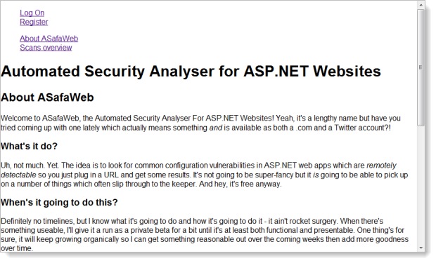
Let me demonstrate; in the following image you’ll see what the current “About ASafaWeb” page looks like with no CSS whatsoever:
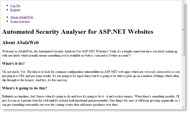
That’s fine, pretty much what we’d expect. Now let me apply the CSS reset:
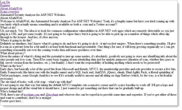
Whoa – WTF?! You see, what I didn’t quite realise earlier on was that the reset was actually stripping out the default rendering of tags. The reason I didn’t realise this is that I’d chucked the reset definitions up the top of the existing CSS from the default ASP.NET MVC 3 template which then goes on to redefine a lot of these defaults. And that, as I’ve since learnt, is kind of the point of a reset; strip things down to the metal then define them from scratch. It’s a very explicit way of working.
Now let’s remove the reset and apply normalize.css (I’ve refrained from renaming it normalise.css!) and let’s see how things look:
Ok, so now we’re almost back to the default behaviour. The list item bullets have been removed and the margin has gone from the body. Oh, and everything is now a sans-serif font but other than that we’re pretty much back at the default browser behaviour. And that’s really the point – normalize.css preserves most of the defaults and aligns behaviour across browsers. Naturally it can’t both preserve all behaviours and be entirely consistent or it would serve no purpose so something has to give in some browsers in terms of deviation from the default.
Personally I prefer this approach because I think the basics such as headings being larger and bolder than paragraphs is a fairly intuitive thing to do. Granted, proponents of both do suggest using each as a starting point and then customising from there but normalize.css just seems to be better aligned to the native intent of the browser rendering. The other thing I like about it is this:
/*
 * 1. Corrects text resizing oddly in IE6/7 when body font-size is set using em units
 *    http://clagnut.com/blog/348/#c790
 * 2. Keeps page centred in all browsers regardless of content height
 * 3. Prevents iOS text size adjust after orientation change, without disabling user zoom
 *    www.456bereastreet.com/archive/201012/controlling_text_size_in_safari_for_ios_without_disabling_user_zoom/
 */

html {
    font-size: 100%; /* 1 */
    overflow-y: scroll; /* 2 */
    -webkit-text-size-adjust: 100%; /* 3 */
    -ms-text-size-adjust: 100%; /* 3 */
}

/*
 * Addresses margins handled incorrectly in IE6/7
 */

body {
    margin: 0;
}

/*
 * Addresses font-family inconsistency between 'textarea' and other form elements.
 */

body,
button,
input,
select,
textarea {
    font-family: sans-serif;
}
You see that? Lots of nice descriptive feedback as to specifically what each style definition is setting out to do. I like the explicit nature of how this file has been commented both because it’s a bit educational and I think it will make life a whole lot easier later on if I do find a glitch. It’s also clear from the Github revision history that the styles are constantly evolving and (I assume) responding to new idiosyncrasies in browsers. It just feels like a more thorough approach than the reset.
Building a navigation
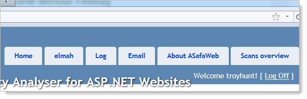
Moving on to ASafaWeb’s nav, I wanted to go with something unobtrusive with the focus clearly remaining on the page content. The nav in this app plays a very low-key role and the primary functions of the site are all pretty big and bold on the page. In fact, most of what you see in the nav in the image below is for administrative purposes so end users won’t be encountering it anyway.

This is a pretty vanilla nav for now and I’m reserving the right to totally change my mind! But what I do like is that it’s unobtrusive in position, dimensions and colours. There’s a little variety thrown into the mix once rollover states emerge but for the most part it’s very discrete.
What’s not clear from the image above is that it also scales well. The “Log off troyhunt” text floats over to the far right edge and the nav items over to the left. I’ll talk more about content widths and wrapping in the next part of the series.
Summary
I’ve spent quite a bit of time mucking around with establishing baselines first using the CSS reset and then with normalize.css. It can feel a bit counter-productive at times but it’s the sort of foundational work which can save headaches later on when things are more complex and problems arise. Time well invested IMHO.
So it’s slow and steady, organic growth for ASafaWeb at this stage. The next post will get into one of the more big ticket layout issues though (fixed versus variable width design and also typography) so things should start feeling a little more cohesive after that.