As I’ve written in the past, I put an awful lot of effort into making Have I been pwned? (HIBP) fast. Not just a bit fast, blisteringly fast and that includes when it’s under a huge amount of load. But there was something bugging me with the site when it came to performance and it was this:
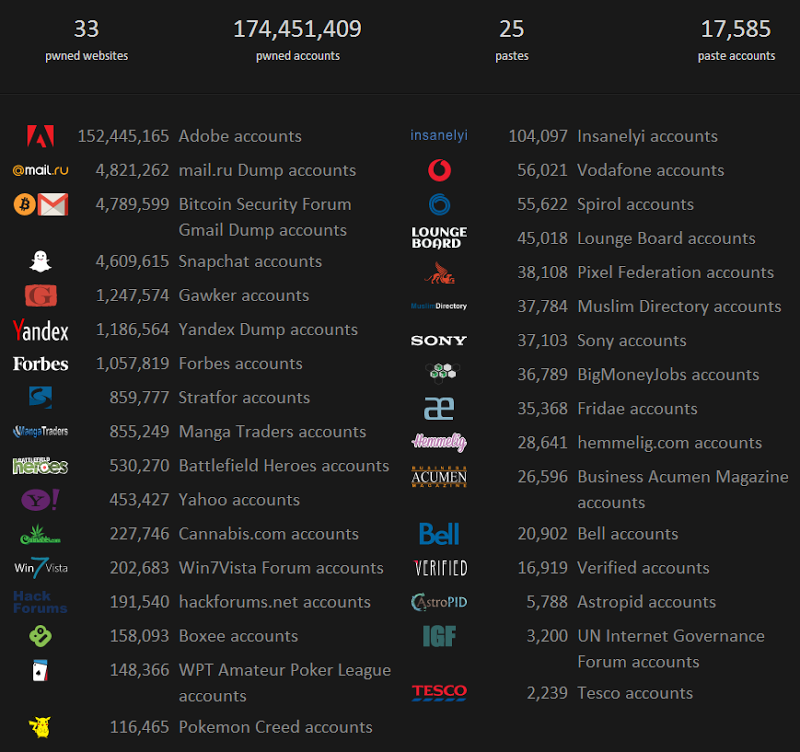
That’s right, 33 images loaded on the front page. Yes they’re SVG and yes they’re tiny and yes they’re served from a CDN but you simply cannot get past the fact that the browser needs to make a heap of additional requests to load them. Granted, you could sprite them (yes, you can do this with SVGs) but you can’t escape the additional bytes that need to be downloaded nor the additional rendering time in the browser (this is more significant then you might think – we’ll come back to this).
This model (each breach on the front page) worked fine when there were only a handful of them, but wouldn’t you know it, sites keep getting breached, data keeps adding up and more logos appear. I had to cap it.
Before making changes for the sake of perf, you really want to measure things. Removing images should be an obvious win, but the web can work in funny ways sometimes. I went to Nik Molnar’s excellent talk at NDC earlier this year (watch the video, it rocks) and he showed things that make you entirely question many conventional wisdoms when it comes to website optimisation. (Great example – using bitmaps with shadow effects you’ve added via Photoshop rather than using CSS shadows.)
One of the easiest measurements going is the Pingdom tools. Throw it a URL, give a few seconds and you get something like this:

Using this deep link, you can go back and inspect that result yourself but let me break it down briefly here for you.
Firstly, 90/100 is a pretty good rating (allegedly faster than 80% of websites already), but let’s see where it’s slowing down. In particular, let’s look at the Page Speed Performance report:

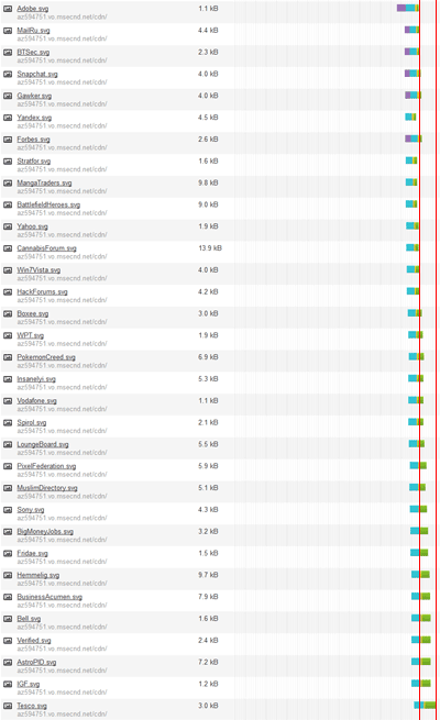
There are a bunch of other 100/100 results there but clearly the problem is the lack of parallelising downloads across hostnames. The real problem is those 33 image requests and they all go to az594751.vo.msecnd.net which is my CDN endpoint on Azure. Pingdom is recommending distributing them across multiple hostnames to increase the browser’s ability to request them in parallel (the browser will only make so many asynchronous requests to the same host).
If we look at the waterfall chart of just the image requests, you get a pretty good idea of what’s going on. It doesn’t matter that this is zoomed right out, I’ve added markers at the end of the first request and the end of the last request to give a sense of duration. What’s interesting is that the first 14 requests all complete at about the same time then after that, everything starts lagging:
So let’s do this: rather than 33 images on the page, let’s cap it at 10 like so:
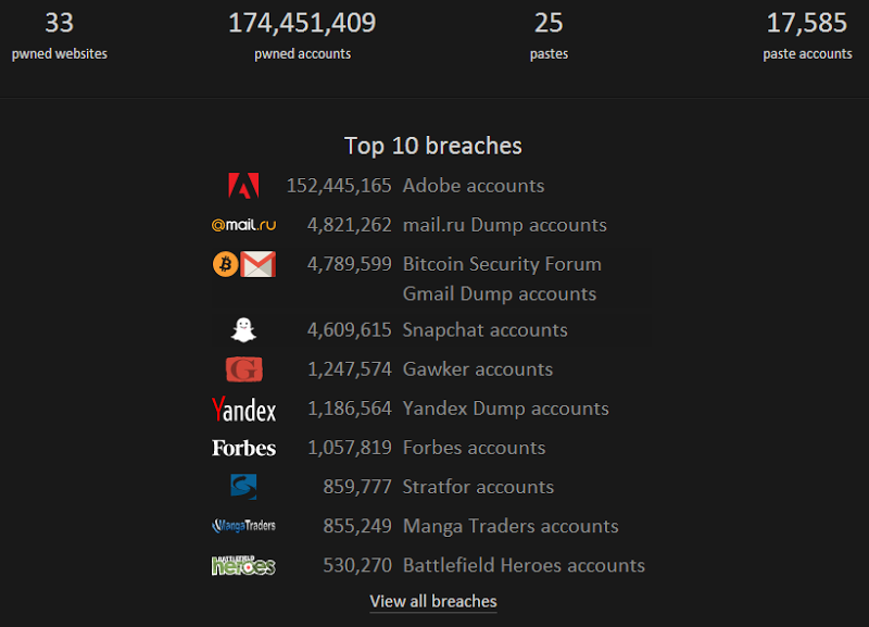
Frankly, that’s all you need, it doesn’t serve much value having every logo there and I’ve added a “view all” link so people can drill down if they really want to see everything. Let’s try Pingdom again:

Here’s another deep link to the result and clearly there are improvements on multiple fronts. The biggie is the requests – they’ve just been halved. The page size has also come way down – that’s a 29% decrease in the bytes that need to be downloaded. It’s also a significant decrease in the bytes I pay for; a bunch of stuff comes from public CDNs already which I don’t pay for and by slashing the downloads from my own personal CDN, I save dollars.
The perf grade has obviously improved as a result of the requests and bytes going down and so too has the load time, down from 1.51 seconds before (but take this with a grain of salt as it fluctuates wildly at the best of times). Let’s check that page speed performance now:
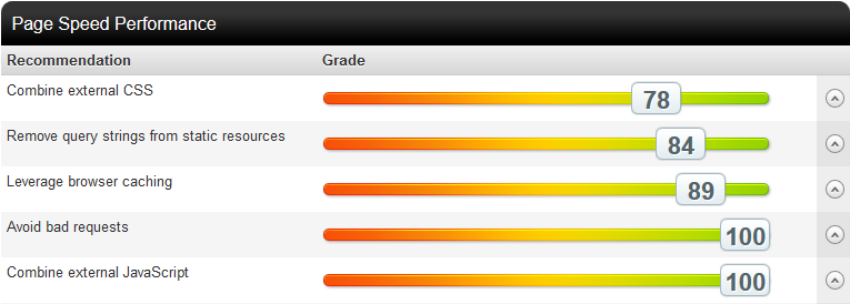
Parallelised downloads have now gone completely which is great (actually, it’s not “gone”, it’s just down the bottom with a 100/100 score). Oddly, the results below 100/100 have all dropped from what they were on the earlier test without having made any changes that would affect them so I can only assume they’re weighted. None of them are bad though and resolving them is no simple task (that’s a story for another time).
So this is all good and very theoretical. What I mean by that is tools like Pingdom do a great job of breaking down the page performance in an analytical fashion and describing how it should perform for end users, but it’s not entirely representative of what users experience as they get spread out all over the world with varying connections and browsers and unpredictable dependencies. This is where NewRelic comes in.
Here’s a six hour window of performance yesterday:
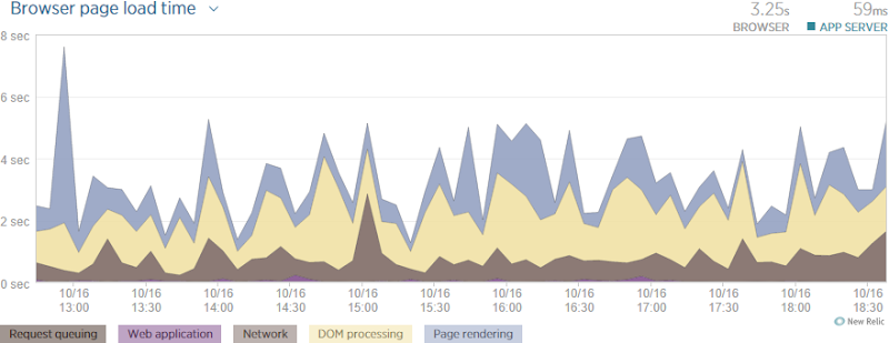
What’s really neat is the way NewRelic breaks the data down into the various components that all contribute to the overall load time of the page. Now remember – this is what the user is experiencing in their browser (NewRelic adds some client script to track this) and it’s the culmination of thousands of requests from all over the world. It’s higher than the Pingdom result as this includes both DOM and page rendering, not just how long it took everything to download. The bottom line here was that yesterday, it took 3.25 seconds for the page to fully load.
Here’s what’s happened since the update today:
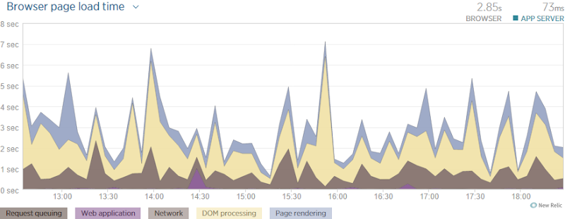
It’s actually taken a bit longer on the server today (although 14ms is no more than just an arbitrary fluctuation) yet I’ve shaved 400ms of the load time of the page. That’s a win! Whilst I can’t break out individual figures for the elements above, it looks like a lot of improvement in page rendering, in fact more so than in the network which surprises me a bit. But then again, that may just be the oddities of performance that I mentioned earlier; perhaps it genuinely consumed more time to render those extra 23 SVGs then it did to download them. Either way, it’s a marked improvement.
Of course this is a predictable result – reducing all those requests was always going to improve the state of affairs. The important point I want to make here though is that you need to be able to base decisions made around performance and scale on tangible observations. So frequently I see people observe a behaviour (it’s too slow) draw a conclusion (we need more power) and then end up disappointed (crap, it’s still too slow). This is no way to approach the technology, not when we have tools like the ones above and many other excellent examples at our disposal.