We’re a few days into the new year and I’m sick of it already. This is fundamental web usability 101 stuff that plagues us all and makes our online life that much more painful than it needs to be. None of these practices – none of them – is ever met with “Oh how nice, this site is doing that thing”. Every one of these is absolutely driving the web into a dismal abyss of frustration and much ranting by all.
And before anyone retorts with “Oh you can just install this do-whacky plugin which rewrites the page or changes the behaviour”, no, that’s entirely not the point. Not only does it not solve a bunch of the problems, it shouldn’t damn well have to! How about we all just agree to stop making the web a less enjoyable place and not do these things from the outset?
Allow me to totally lose my cool for a bit and tell you just what’s wrong with the web today:
Surveys and other crap – anything that takes over my screen
This, is inexcusable:
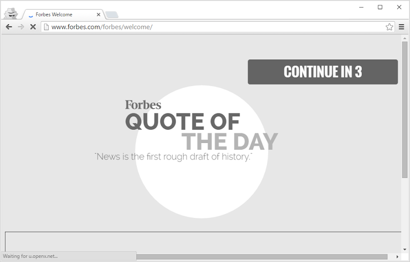
So I go to a link like http://www.forbes.com/sites/stevemorgan/2016/01/02/one-million-cybersecurity-job-openings-in-2016/ which is clearly the specific URL I want to view and you guys then say “No, let us instead redirect you to show you a quote of the day and an ad… then make you wait”. Bull. Shit. This is just outright nasty and nobody – nobody – ever sees this and then reflects on how much better off they are as a result.
The back button – let it do its job!
Banks – you guys in particular need to pay attention here because you’ve been screwing this up for way too long. The back button takes you to the page you were just on, the forward button returns you to where you were before you pushed the back button. Get it? This sort of thing after pressing “back” is just not on:
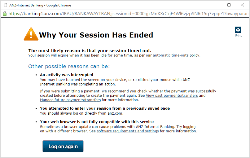
Why did my session end? Another possible reason is that the user clicked the most fundamental browser navigation item in existence and you guys chucked a wobbly over it. I know that you don’t want transactions repeated but it’s not exactly hard to ensure that doesn’t happen. The approach of throwing up your hands in despair when someone uses this most fundamental of usability controls or simply breaking the page altogether is just not on. Fix your damn site!
Multi-part articles – you can fit it all on one page
This crap has gotta stop:
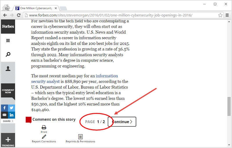
This is why we have scrolling – you read a bit and when the rest of the content doesn’t fit on the screen you scroll down and read a bit more. Get it? Granted, you don’t get to bombard us with as many ads but hey, we didn’t really like that in the first place anyway!
Passwords – let me have whatever I want
When you block a character, I’m going to assume one thing: your input sanitisation and your query parameterisation sucks. You’ve screwed it up to the point that you simply can’t trust the app not to be SQL injected if you don’t disallow those characters. Just like these guys:
Oh, TWC pic.twitter.com/zbrZy2tMk9
— Rod Trent (@rodtrent) January 3, 2016 Worse yet, I’m going to assume that you’re not hashing the password and are instead storing it in plain text. What other reasonable assumption is there – the web app clearly hasn’t left it in a stable state before sending it to the database!
Full screen and popover ads – die a fiery death
Did I mention how much we don’t like ads when they degrade the user experience? Yeah, well this has also gotta stop:
I mean seriously, what are you thinking?! Have you any idea how infuriating this is, particular when it can be so bloody hard to even find the button that gets rid of the thing? It’s even worse on mobile and it’s the personification of a usability anti-pattern. Just look at that screen above – here you have a full page width banner ad consuming half the screen then you’ve gone “Hmm… needs more ad” and chucked a popover one on there too. Your ad is actually partially covering up your other ad! What the hell are you guys thinking?!
Delayed popover ads – evil personified
Full screen ads that hit you in the face as soon as the page loads is bad enough, but having the opportunity to start reading and then cop an eyeful of this is just not on:

I have no idea why I needed to get hit with a, um, “well-equipped” girl in this way when all I wanted to do was understand what these Oregon militia shenanigans are about, but here we are. Worse, I’ve got a tiny, tiny “close” button just smaller than my finger which is the only way of getting rid of the damn thing on the iPad. Fortunately, this one does just infect (that seems like a fair word) Apple’s tablet and you won’t see it on a PC, but you’ve seen it before and you hate it as much as I do.
Implausible ads – ban them
Look – I get it – websites need to monetise and there shall be some degree of ads, I even do it here. But let’s cut out anything as ridiculous as this:
These ads may be somewhat misrepresenting the level of income required to buy a Lamborghini or Rolls Royce... pic.twitter.com/WvLtqcrgbh
— Troy Hunt (@troyhunt) December 25, 2015 These “promoted links” (get over yourself guys – they’re ads) have kindly been tailored to my location so let’s suspend belief for a moment (including the steering wheels being on the wrong side of the cars) and see just how old mate goes buying his Lambo here. The cheapest Aventador going in Aus is presently $650k (the most expensive is over $1M) which means that by the time you factor in the lease repayments (or opportunity cost if you stump up the cash) plus maintenance, depreciation, insurance and running costs, you’re going to be in the hole very close to six figures. Meanwhile, a “mere” $3.5k gross a week leaves you with ballpark $120k net per year so you’ve got – let’s be generous – $30k left to live after paying for your raging bull. Unless you want to perpetually live in your parent’s house (that wouldn’t look quite as nice in the ads), this is bullshit and needs to stop appearing.
EU cookie warnings – this is just plain stupid
Oh noes – cookies! Seriously guys, what the hell is going on with this:
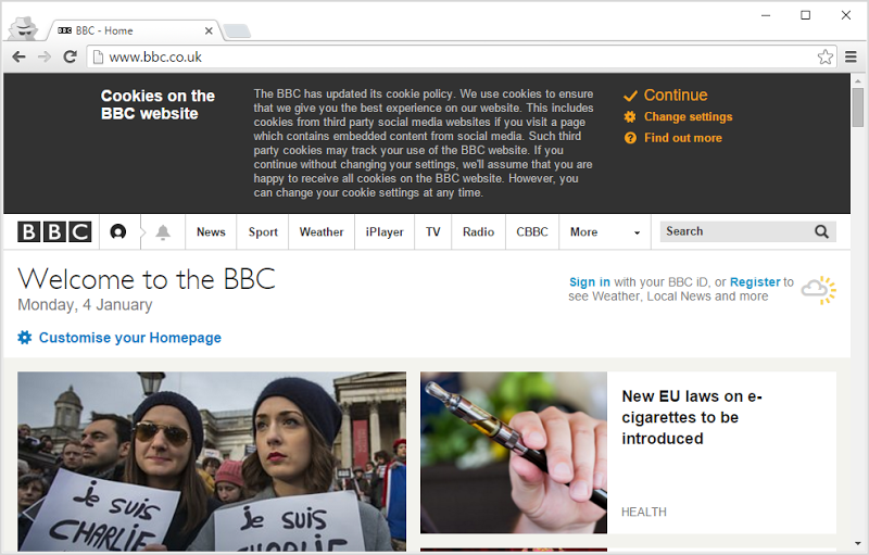
A whole heap of stuff isn’t going to work without cookies or requires other compromises in security to do so (i.e. persisting authenticated state via the URL instead), so why even bother? Yes, they can be used for tracking but you don’t need cookies for that anyway – go and check how unique your browser fingerprint is already. Want to know if it’s the same person visiting the website as who came by before? Don’t need cookies for that. All you’re doing is preconditioning people to ignore a security warning for absolutely no practical upside.
Scroll hijacking – that’s not how websites work!
This just reeks of some designer going “Hey mum, look what I can do!” whilst infuriating everyone else in the interim. Not familiar with the term? Try Apple’s Mac Pro page:
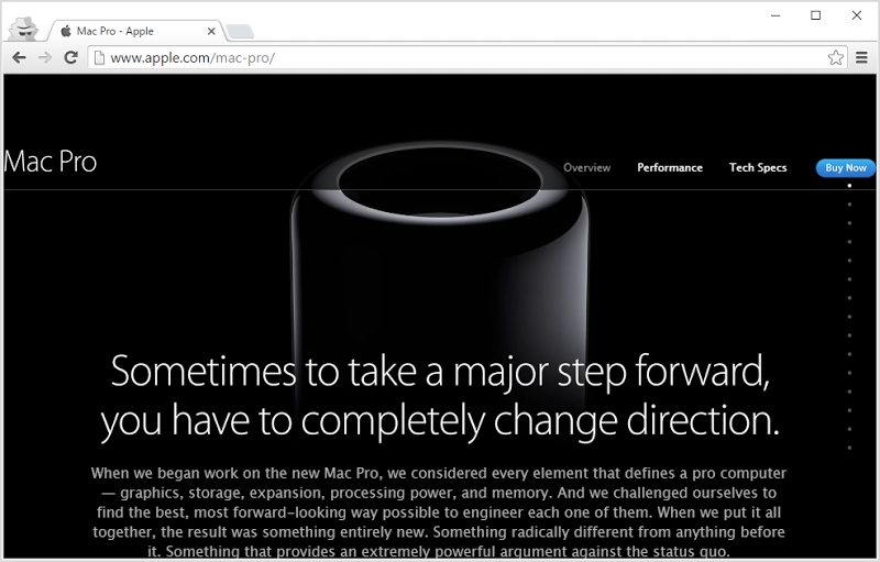
See how that works? You scroll down but the page doesn’t scroll, you just get different shit appearing on the page. Over thousands of visits to thousands of websites we’ve learned that you can scroll down to access content “beneath the fold” and then scroll back up to the other stuff you were on earlier. The likes of Apple, in all their wisdom, have taken a ubiquitous user interaction and completely turned it on its head so that it does something you never expected it to. This is crap and should be stopped!
Bait headlines – how desperate are you?!
I seem to get bombarded with this sort of rubbish courtesy of friends on Facebook:

Hey, how about this – tell me in the headline or description what France actually did and then I’ll decide if I should invest my time in actually reading the story, ok? I mean you could have said is “There’s now a bill that bans them from throwing out food” and I could have taken just that snippet and gotten on with life. Oh, would that mean I don’t click on a bunch of the garbage I’m confronted with daily and you’ll miss some ad revenue? Geez, we just can’t get away from how badly nasty ads are screwing up the web, can we?!
Auto-play – never, ever do this!
When I go to a site to read a story (that’s the thing you do with your eyes, not your ears), I don’t want this:
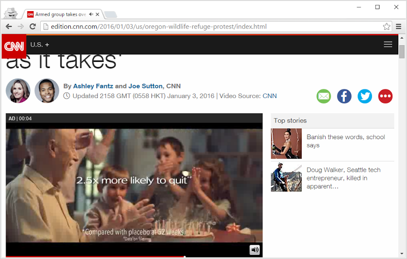
This is an ad auto-playing on CNN and as if flashy, jumpy ads of the old days weren’t bad enough, we’re talking audio here too. So I’ve just gone to read a story – possibly in an environment where I want to remain quiet (I’m not the only one who reads their iPad in bed, right?!) – and these guys have gone “No, I think what Troy really wants is to hear an ad for smoking cessation”. They then also auto-play a news video on the story which is only slightly less bad because again, I came there to read – this isn’t YouTube – if I want to listen to a news article then I can always press a big “Play” button in the middle of the optional video.
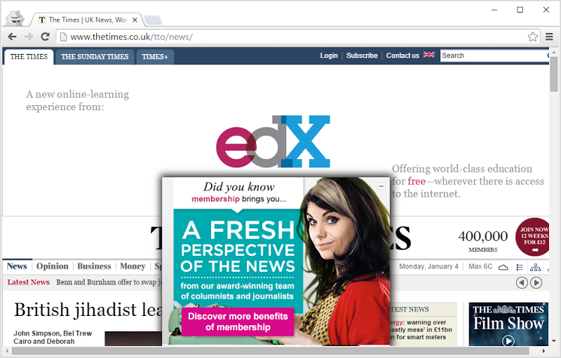
Paywalls – no!
Every now and then you’ll see a story shared somewhere and the headline looks good, so you click it. Then you get this:
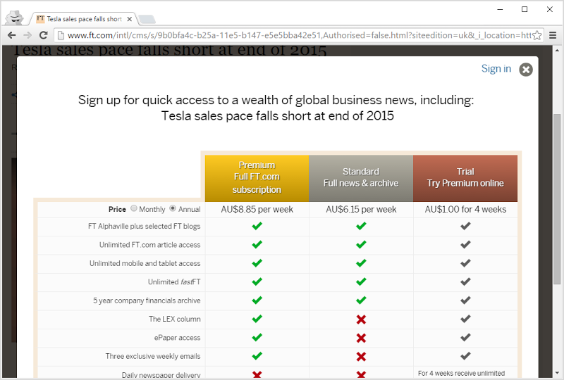
The worst thing about this experience is that for a fleeting moment, you see the actual story and then it’s suddenly snatched away from you. It’s there in the background and it’s been loaded into the browser, but now you’ve been paywalled. You try and close the modal using the little cross because that’s exactly what that little UX control is meant to do and now you’re redirected back on the home page, ready to see another story that looks interesting and repeat the entire process. Thank guys, that’s just awesome.
Mobile app – no, I don’t want it, I just want to read the damn website!
So you’re reading an article on a website on your mobile device which is doing an absolutely fine job of rendering text on a screen, yet you’re faced with this:
Remind me why I need the app? How will it make my reading of this one story any better? I know how it makes it worse because it takes away a chunk of my screen for no apparent upside and that’s an iPhone 6 Plus too so chuck it on a smaller phone and you’re demanding a quarter of someone’s screen real estate for what – a promotion of a three star rated app?!
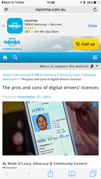
Mobile sites – that’s not what I wanted to share
And while I’m ranting about the NRMA’s website, look what happens when I share that link from my iPhone:
What I'm looking forward to re digital drivers licenses is how easy it'll be for kids to share them via social media https://t.co/56wtxZLlLp
— Troy Hunt (@troyhunt) January 4, 2016 You see that? The “m.” prefix was kindly added when I loaded the site on my mobile device and now I’m stuck sharing that URL. Everyone who opens it up on the desktop now gets the mobile version of the site which means I’m sitting here at my PC looking at about 80% wasted space and buttons that are literally 1,850 pixels wide. This is why we have responsive design – you detect the capabilities of the device and then display content in an appropriate way, not boot people off to another location then keep them there even when it looks like crap on their big screen!
Company email – I’ll decide what my company email is, not you
I’m very happy using Hotmail, I’ve had the address for going on 20 years and it’s served me well. I use it for business and I use it to sign up to places like this:
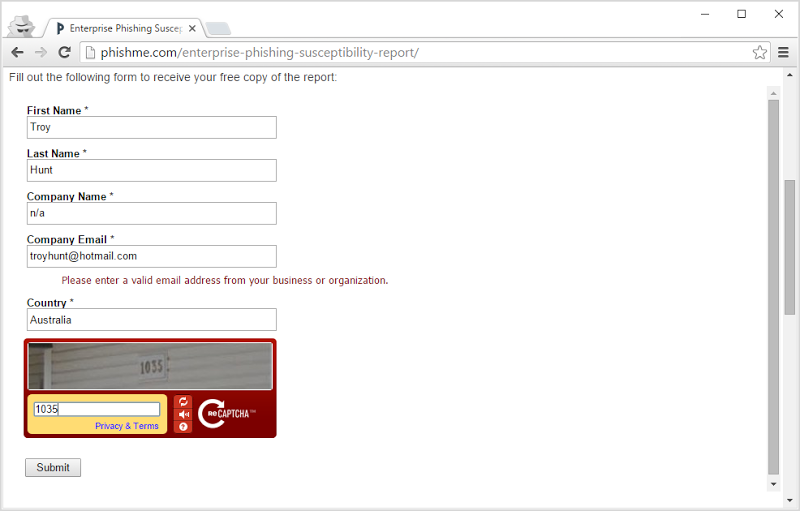
Well at least I use it to sign up for things except when I can’t. You know the solution to this? You go and grab one of Mailinator’s alternate domains (PhishMe also blocks @mailinator.com) and you sign up with something like NowYouCantEmailMe@spambooger.com which mean that you get your report and they can’t get in touch with you. How’s that one working out for you now guys?
Blocking ad blockers – how much do you really want to piss people off?!
I have ads on this blog. The more people that see them, the more money I make so I’d like you to see my ads, but then I don’t do any of the really abrasive stuff with them you’ve read about above. However, if you really must run an ad blocker (precisely because of the sort of shit listed above), then I understand where you’re coming from. Mind you, don’t come complaining that you’ve re-written parts of my site and now stuff doesn’t work, but I’m certainly not going to make life hard on you.
Not everyone is of this view:
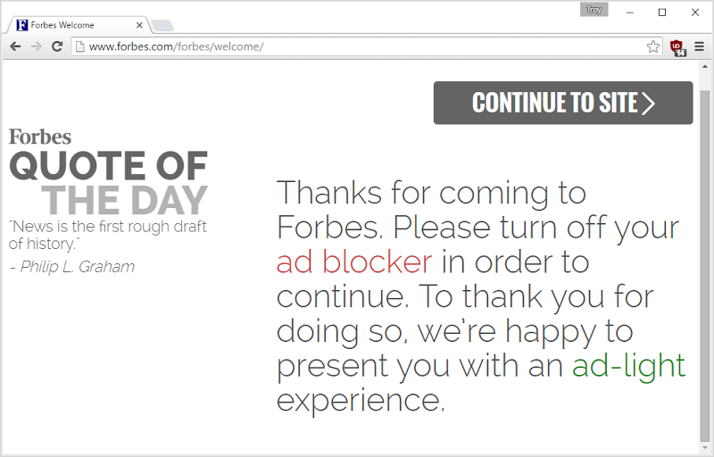
Here’s the irony of the whole thing – because of the nasty practices the likes of Forbes have been employing with their ads, people run ad blockers. Because people run ad blockers, Forbes and others escalate the fight by denying or degrading service. They’re not happy, people using ad blockers aren’t happy and I’m not happy because it forces more people to use ad blockers and I lose revenue!
One more thing on Forbes because they’ve featured quite heavily here: I asked this earlier today:
What's a good example of a website hitting you with a full screen ad as soon as you load it?
— Troy Hunt (@troyhunt) January 4, 2016 Forbes people – just read the responses and see if you spot the trend. I’ve contributed to a bunch of Forbes articles before and worked with some really top notch people there, but whoever is responsible for the stuff documented above needs their head read.
Can’t we fix this stuff and all just get along on the web?
What did I miss?
Ah, that feels better! This stuff all drives me nuts, but I’m sure there’s more to it than that – what do you see sites doing these days that makes you want to go off on a rant of your own?