
Azure Web Sites are not your father’s hosting. The big thing you need to wrap your head around is that this model of standing up web sites moves us away from the classic paradigm of just firing up files over FTP then not thinking about the hosting again to one where serving content over HTTP is but one service of the hosting model. You can bring this mindset to Azure if you like, but you’ll be missing some of the best bits.
It struck me this weekend just how much information was at my fingertips and how well it all works together when I got a monitoring alert for Have I been pwned? (HIBP). The investigation after that showed some really interesting insights I thought I’d share because I’m finding that when I talk to people about Azure, they’ve no idea this capability is in there. The best bet is that all you also get all this for free when you stand up a site on Azure.
Monitoring alerts
Just last week, Scott Gu announced a bunch of new shiny bits for Azure including the ability to monitor various metrics by the minute. What that means is that you get data like this:
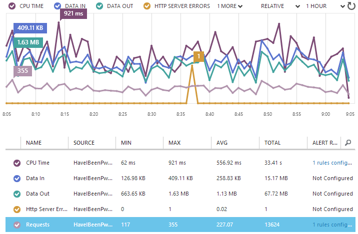
What really rocks with such fine grained reporting is that you can push out a change and immediately see the stats on how it’s performing. For example, you can tell if it causes the CPU to suddenly spike, the bandwidth usage to go up or HTTP errors to begin occurring. Some of these we could do some of the time in classic website hosting models but in Azure Web Sites, it just happens automatically.
Here’s the really neat bit – with a metric selected like I’ve done with “Requests” above, I can now add a rule from the toolbar at the bottom of the page:

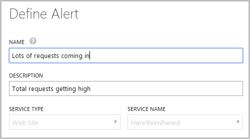
In my case, I’d already made a rule that looks like this:
I then defined the rule as follows:
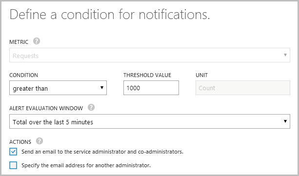
In other words, I want to know when the site gets busy and the easiest way to do that is to look at the requests. I also have another one that monitors the CPU usage (not quite the same as requests as different processes consume different levels of compute power), as I want to know when something is happening that might scale out the resources that I’m paying for.
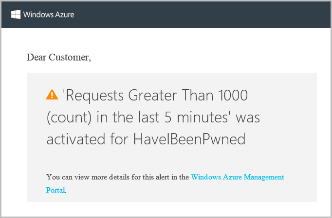
So I dropped that alert in on Friday then sure enough, at 04:03 on Saturday I get this email:
Ooh, interesting, I wonder what’s going on? Let’s take a look at how the other services in Azure help answer that question.
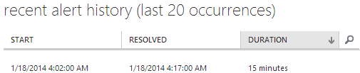
One last thing before we move on – you can monitor the alert history which gives you info like this:
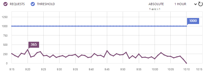
What we’re seeing here is the average number of requests over the 5 minute period preceding 09:20 maxing out at 365 which is now back down well under the 1,000 threshold. We can also see when the alert was last actually hit:
All very neat info. Let’s move on.
Diagnosing activity with NewRelic
So I’m laying bed with the iPad when I read that email (no, I’m not monitoring my email at 4am, this is all in a dozy haze some hours later on) and I reckon the easiest way to look at stats in that environment is with the NewRelic iPad app. I’d enabled NewRelic pretty early on when I realised the site was actually getting some decent traffic and just in case it’s new to you, this is an Azure Web Sites freebie (at least the Standard edition is). Get this, turn it on and never look back.
Anyway, I open it up and here’s what I see for the last 12 hours:
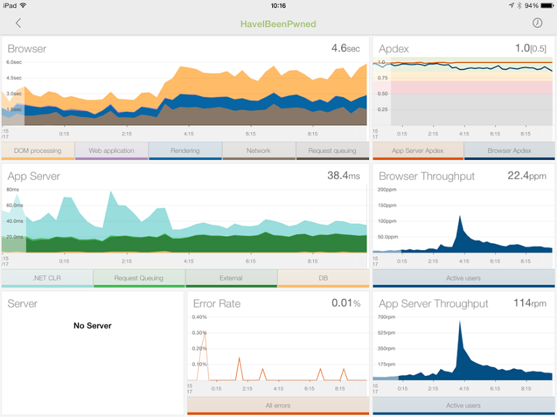
There’s a lot of stuff going on here but two things in particular stand out. Firstly, the two throughput graphs in the bottom right show the requests going way up around 4am which reconciles with the alert (“requests” per minute is 5 times higher than “pages” per minute as it includes CSS, JavaScript, images, etc).
But the really interesting one is the browser time graph in the top left. What we’re seeing here is the time taken to get this onto the client and rendered in the browser actually increase around 4am or in other words, it’s starting to take people a lot longer to load the site. Now I know what you’re thinking – more traffic is more load so things go slower – but you’re wrong. That usage is spiking at 600 requests per minute and at that rate, the site is literally sitting back in its metaphorical hammock drinking Coronas. For a well-designed site running in this environment, that sort of volume is nothing.
Something else must be happening and to work that out we need to break down the graph a little. At present, that guy up in the top left is reporting across 5 different metrics: DOM processing, Web Application, Rendering, Network and Request queuing. Let’s filter that down a bit and take a look at just what’s happening in the web app:
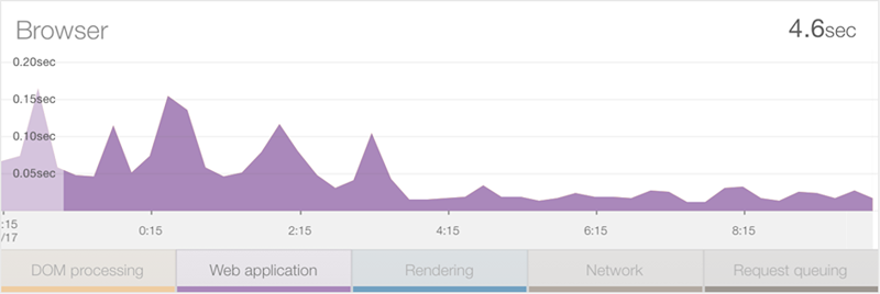
Wait – that processing time on the server has actually gone down over this period – what gives?! One thing you need to understand here is that this is an average across all requests so is may be that the usage pattern has changed. Well obviously the usage pattern has changed in terms of volume, but what I mean is that it’s also changed in terms of the resources that volume is being distributed across.
Let’s take a look at the network component:
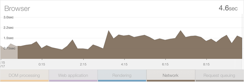
Ok, so this is telling – the network duration has actually increased by about 0.75 per cent. Keeping in mind there weren’t any changes to the app at that time, this will only have happened because either the usage pattern means that more bandwidth hungry resources are being loaded or that the usage demographic has changed such that a much larger percentage of people are coming from a location with lower bandwidth.
Let’s take a look at one more stat – DOM processing:
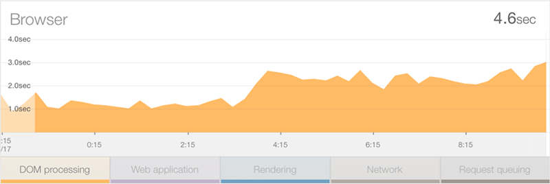
This has added well over a second to the average load time. Now keep in mind that this isn’t about bandwidth – we’ve already covered that – this is about for some reason, it taking longer for the client’s machine to process all the goings on that occur in the DOM. Typically this could be explained away by the clients being lower spec, either old machines or possibly a more mobile-centric audience with less powerful devices.
We’re really getting into the user demographics side of things now so let’s jump over the Google Analytics and see what’s happening there.
Assessing demographics with Google Analytics
First things first, Google agrees that stuff got busy very early on Saturday morning:
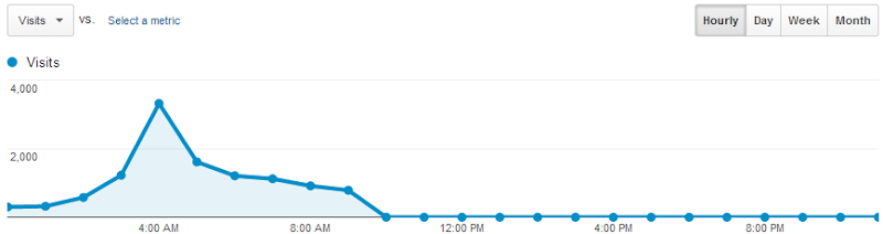
We’re seeing a full day here and writing this on Saturday morning means the graph goes down to zero in the hours yet to come. One of the things I’m interested in though is why the time in the DOM has increased so much – is it spending more time in mobile devices, perhaps? We can ask Analytics that:
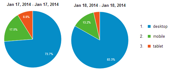
Nope, mobile usage is actually down on the day before so it’s not that. That DOM processing time has doubled on the desktop. Of course the bit I’m really interested in is the demographics – all the signs to date are pointing to slower traffic with slower browsers, where might these guys be coming from? Let’s take a look:
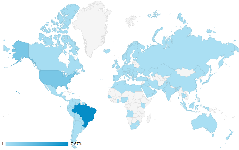
Olá Brazil! And now the dots are joined. Here we have a country that is many thousands of kilometres away from the west coast of the US where the website is hosted so naturally we’re going to see significantly slower network times. We’re also talking about an emerging market: depending on who you read, they have about one fifth the GDP per capita of folks in the US so you’d also expect them to have older, slower equipment that affects the DOM timings.
So there’s only one question remaining now – why? What is it that is bringing people from Brazil such that they’ve made up 68% of the audience in the stats above yet only a third of one per cent in the preceding day?
Let’s check the acquisition stats:
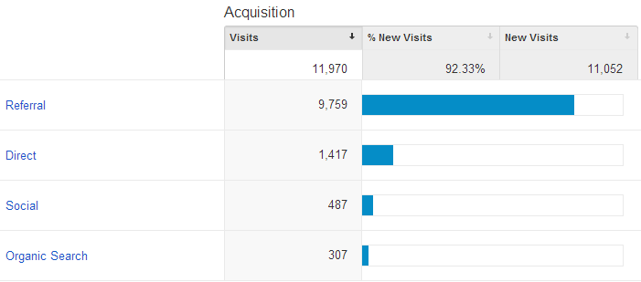
It’s predominantly referral traffic rather than direct or social so it’s not like something has gone nuts on the Twitters or Facebook, let’s drill down and see where they’ve coming from:
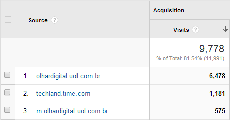
That’s the final piece of the puzzle – more than 7,000 referrals from two Brazilian web sites just like this one:

Going back to the original point of it all, it’s the Azure Web Site monitoring and alerts combined with the free NewRelic add-on that makes this sort of info not just genuinely interesting, but also extremely valuable. Particularly when things go wrong, the ability to join the dots on processing time within the app, network and DOM timings, bandwidth and user demographics all tied in with the data we’ve had available from Google Analytics for some time now – all of this being free when you already have those Azure Web Sites – is, IMHO, very awesome.