Three and a bit years on and it’s time for a change. Blogging has been good to me – very good – but I was starting to feel a bit like the plumber whose own house was full of leaky pipes.
Heavy markup burdened by Blogger’s propensity for in-page CSS, completely mobile unaware and as I’ve written before, not real friendly for those half a billion Chinese internet users. Plus of course, several years of design weariness which eventually leaves you feeling like you’re getting around in clothes from the 80s.
There are a whole bunch of things that change in the seemingly short timeframe that is three years, things worth sharing. So here it is – the meta post – the blog about the blog but far from being self-indulgent, I think there’s actually some useful stuff in here.
Embracing metr... uh, I mean colourful rectangular boxes
Don’t say the “m” word! I’m not even entirely sure what to call it these days, but the design paradigm has grown on me. Personally – and certainly this is a personal view as I’m conscious the UX can be polarising – I find it clean, simple and very easy to implement. It’s a nice modular, linear aesthetic that works well with my very structured approach to most things.
One thing you may not know about metro (bugger it, you all know what I mean anyway) is that those big blocks of solid looking colour are, in fact, gradients. Let me demonstrate; here you’ll see a couple of tiles from Windows 8 with a colour picker showing the difference between the pixels in the top left with the pixels in the bottom right of the maps tile (see the “new” and “current” colours in the middle of the dialog):
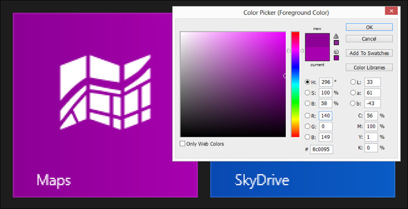
It’s subtle – and barely visible – but there’s a distinct difference leading to a very gradual gradient. I’ve carried this through to the new blog so if you look for it, each of the boxes off to the right implements CSS gradients to break up that blockyness just a little bit.
Responsive design
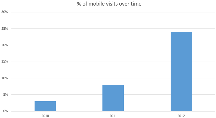
Mobile is big, very big. Depending on the stats you read and the agenda of the author, the mobile audience is becoming more significant than the PC audience. From my Google Analytics stats, in November 2010 my mobile audience accounted for just 3% of my visits. November 2011 more than doubled that up to 8%. In the November just gone, it was 24% – that’s a three-bloody-fold increase is just one year! Let me make a dramatic visual out of it:
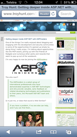
The problem, of course, is that many sites simply don’t play nice with mobile. Let me demonstrate by showing the last article I wrote in the old template:
And now in the new:

That, my friends, is a totally different experience.
Actually, the old one is nowhere near as bad as many I often see, but the primary deficiency is that it’s trying to render content designed for 1024 or more pixels across in only 320 pixels. Naturally, the only way to do this is to shrink stuff way down to the point where it becomes nearly illegible. Yes, you can pinch and zoom but then other content is cut out and you’re still looking at a layout locked to 620 pixels wide (my choice in the old design).
You’ve got two paths to go down in the mobile friendly world:
- Mobile views: Totally separate markup for PC versus mobile, often indicated by the presence of an “m” floating around in the URL somewhere such as “m.mydomain” or “mydomain/m”.
- Responsive design: Same markup but it adapts – nay responds – to the difference in form factor usually be leveraging CSS media queries to change the layout of the page.
I’ve opted for the latter is it allows me to gradually turn stuff off or reflow it into different positions as the browser width changes. You can see this in action just by resizing the window and what you’ll find is six different stages of design:
- 1,505 pixels or more of horizontal space: This is the full fat version with two columns worth of side bars and an outer container with a gradient. It’ll lock the max width of the main content wrapper to 1,470 pixels so that folks on really big res don’t end up with paragraphs stretching out and only taking up a single line.
- 1,240 to 1,505 pixels: No need for the shaded background with funky rounded corners, turn that off (kill the margins) and maximise the real estate.
- 982 to 1,240 pixels: The primary body content starts getting too narrow beneath 1,240 so it’s time to make some more space by stacking the side bars one on top of the other. This buys back a heap of space without losing any content. Along with this the social media icons and search bar collapse to half their size and I also scale down the title and strap line so it doesn’t push the page width out as things get narrower.
- 860 to 982 pixels: That’s it, we’re outta room! The side bars go because there’s simply no longer the room to show them.
- 630 to 860 pixels: Space is getting even tighter so the header and strapline need to scale down even further.
- Less than 630 pixels: We’re down into smart phone territory here which means catering to a res down to a few hundred pixels wide. The strapline goes altogether and the header drops under the social media icons and search.
I’ve arrived at these limits simply through trial and error based on my particular design. Other designs will differ in terms of limits and how many stages of “degradation” are required. I took a few leaves out of Scott Hanselman’s blog during the design and you’ll see similar behaviour over there.
What it all means is lots of this action:
@media only screen and (max-width: 1505px)
{
  /* Do stuff here... */
}
“Do stuff here” usually means toggling visibility, changing font sizes or adjusting margins. There are 5 mote “max-width” queries that gradually decrement as per the bullet points further up.
The other thing I’ve done is allowed images to gracefully resize. In the past, I had 620 pixels of width for the article and any images so consequently that’s what many of my screen grabs were locked into. Not any more, if you take the Photoshop image of the metro icons above, that’s now a full 882 pixels wide but it has a max width of 100% and an auto height so as the horizontal real estate shrinks, so will the image. No horizontal scrolling, just graceful shrinking.
Allowing the browser to resize images has always been a no-no. It didn’t use to be done very gracefully (pixilation, anyone?) and of course it meant sucking down more bytes than you really needed. The latter is still true, but it means you can service any res device with a single image and browsers actually do a pretty good resizing job these days. Again, try narrowing the screen and you’ll see what I mean.
The last thing was ensuring that any overflow outside the article space was hidden. What do I mean by this? Say I whack in a YouTube video embedded at 620 pixels wide but the horizontal space is only 500 pixels. The embedded video won’t scale down like images will (somebody tell me if I’ve got this wrong, but I couldn’t make it play nice), so the bits that extend beyond the available width simply disappear rather than forcing horizontal scrolling which, as we all know, if the devil’s spawn.
The last thing I’d suggest on responsive design is to take a look at Responsinator. This is a pretty neat way of looking at how a site behaves on smaller form factor devices and you get nice visuals like this:

Responsive design, IMHO, is absolutely essential for any new site. Certainly any that I’m involved in will get a Responsinatored and deep links to misbehaving URLs shared around very quickly if it doesn’t play nice. “What do you mean a large, rapidly increasing segment of our audience can’t view the site properly? Fix it, dammit!”
Playing nice with Retina
While we’re talking about playing nice across devices, how about that newfangled Retina goodness? Well actually, we’re more than 2 years into Retina on the iPhone now plus of course it’s also on the iPad and MacBook Pro. There are other flavours of high pixel densities out there as well, the point is that the day of 72 DPI only screens are now behind us.
Why does it matter? Because on a Retina device it means the difference between the image on the left versus the image on the right:


Now that’s a dramatisation because you can’t show what Retina images looks like on a non-Retina screen (which chances are you’re reading this on right now), but the point is that you classic DPI bitmaps look, well, a bit crap. The image on the right effectively uses somewhere in the order of four times as many pixels to show the same solid block of colour.
You’ve got two options for slicker Retina images:
- Double the dimensions: Instead of a 90x90 you create the original at 180x180 then set the height and width attributes in the markup to 90x90. When you do this, you jam more pixels into the same place. You can then either use this across the board and stuff more pixels than most people can use into their browser or you can even use CSS media queries to pull the right ones down.
- Use SVGs: Scalar Vector Graphics do away with pixel perfection and instead describe paths. SVGs are simply text files that map points and colours so they can be infinitely resized without loss of quality.
SVGs are great for icons like the social media ones above so after creating them in Illustrator I exported them direct to SVG. The same image can be embedded at any size which is great for responsive design as you can shuffle dimensions up and down as you please without loss of quality and they’ll render at whatever pixel density the device can support.
However, it’s not great for IE8. I’ll talk about this laggard a bit more in a moment, but no SVG support means you need an alternative. I’ve dropped in Modernizr then simply said “Hey, if the device can’t do SVG then find anything with a .svg extension and change it to .png”. Clearly this then requires .PNG alternatives to each SVG but it means that IE8 (and other non-SVG browsers) can still get a first class experience. Unfortunately you can only reliably check for the presence of SVGs once the page has loaded so there’s a little flicker but hey, get a modern browser! Speaking of which…
Playing nice with IE8 (because even luddites matter – but not very much)
In the last month, 3.755% of visitors to this site were using IE8. Now I’m all for telling them to get off their backsides and upgrade their browser, but the problem is that you can’t do that while you’re on Windows XP and there are still an uncomfortably large number of people constrained to this adolescent browser by virtue of the governments and corporates they work at.
Then there’s China:
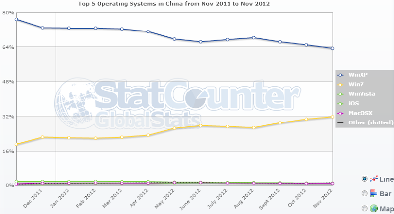
That big blue line up the top is the proportion of the country that’s running XP. That’s 63% of the world’s most populous internet nation whose default OS browser is IE8 at the most (remember, XP won’t do IE9 or 10). I’ll come back to China shortly, let’s just agree for now that it’s a whole lotta people. Incidentally, a couple of years back I wrote Aye, pirates be the reason IE6 just won’t die which I think is still mostly relevant today, albeit about XP,
Of course XP is no reason not to run Chrome or Firefox, but managed desktop environments at your place of work aren’t real conducive to running your own software. Then of course there’s the ingrained “The Internet is Internet Explorer” mindset of many less tech savvy users. In short, IE8 remains relevant and important and there are still many thousands of visitors coming here each year who are using it.
Compatibility wise, I had a few dramas but certainly nothing like the bad old days of IE6 compatibly. The biggest issue with IE8 is that it doesn’t know what HTML 5 and CSS 3 are and there are bits of that sprinkled throughout the site. The single biggest help I found for compatibility was using html5shiv which almost entirely fixed every little styling nuance in one go. Almost.
It’s easy to pull html5shiv in with a conditional statement:
<!--[if lt IE 9]>
<script src="/Scripts/html5shiv.js"></script>
<![endif]-->
And voila; not loaded for those who don’t need it, highly effective for those who do.
Combine and squish
While we’re talking about only giving people what they need, by default, Blogger is extremely inefficient in that it embeds truckloads of CSS in the page head. What that means is no caching and lots of bloat on each page load.
I’ve now shifted all the CSS and JS off to external files hosted on an AppHarbor site that will cache for a year. I’m also using ASP.NET bundling and minification so multiple files are combined into a single one then all the unnecessary bits like white spaces and line returns are stripped out. Then of course there’s HTTP compression on by default so the bundled and minified files then get compressed as well. Optimisation FTW!
Here’s an example of the before state of the SVG to PNG replacement script I mentioned earlier:
// Replace SVG with PNG if not supported
if (!Modernizr.svg) {
  var images = $('img[src$=".svg"]');
  images.each(function (i) {
    $(this).attr('src', $(this).attr('src').replace('.svg', '.png'));
  });
}
And now minified:
Modernizr.svg||(images=$('img[src$=".svg"]'),images.each(function(){$(this).attr("src",$(this).attr("src").replace(".svg",".png"))}))
Totally illegible yet utterly beautiful!
This sort of performance optimisation goes a long way with really little effort. The bundling in particular makes a big difference as every one of those HTTP requests has a latency impact to overcome even if the web server is HTTP compressing the content. Good for the desktop, even better for mobile.
Sharing, and sharing generously
Social media is a massive contributor to my traffic. When a post goes truly viral, it’s social media and the ability to rapidly share the content that brings in the traffic. I’ve watched some posts go from zero to many hundreds of simultaneous viewers in minutes simply because it gets shared so quickly (Google Analytics Real Time rocks!).
Anyway, this is why the social media icons up the top right have so much prominence and why each story has another set of icons specially to share it right up front on the story page. Same reason again why there’s now a little “follow @troyhunt” widget at the bottom of the story.
Social media influence plays a massive part in a post’s success. Good content will still get eyeballs on it, but social influence accelerates that significantly. As screwy as it can be, this is one thing I’ve learnt from Klout.
I have a reasonable Klout (hovers around the high 60s), but when someone like Mikko Hypponen gives a post a plug, things go a little bit silly for a while (40,000 Twitter followers and significant industry influence will do that). Frankly, Klout has a bit too much black magic and pixie dust for my liking but the point is that enabling anyone – particularly those with influence – to re-share material in the easiest possible way is absolutely essential. After all, viewership has its rewards…
Ads. Yes, ads.
I gave in. Succumbed. Sold out. In my defence, blogging is an exceptionally time consuming exercise. Many of my more comprehensive posts are 5,000 words or more and are gradually refined over several weeks. I make a real point of giving away everything I can such as the OWASP Top 10 for .NET developers eBook so when an opportunity came up to commoditise some of that effort, it seemed a reasonable trade :)
The ads are served up by Developer Media who until recently, were known as Lake Quincy. The great thing about these guys is that it’s largely developer-centric ads for things like Windows 8 controls, commercial code libraries and other developer centric services. There are some exceptions (pretty sure I saw something insurance related the other day), but for the most part it’s info analogous to the domain my visitors usually live in. For reference, Developer Media is also behind Hanselman’s ads so there’s some context for you.
I’ve dropped in three ads and done my best to keep them unobtrusive and in keeping with the overall design. Certainly nothing is going to be popping up or making noises or doing anything else obnoxious. In fact they should be relatively tailored to the audience, not in that freaky way like when Facebook started prompting me to buy condoms after posting photos of my second child, but in a interest and geolocation relevant way.
Frankly, I find this an interesting dynamic as ads on sites are not something I’ve been involved with firsthand in the past, at least not as a beneficiary. Clearly there’s now financial incentive to drive traffic and whilst I’m not going to be retiring to a private island any time soon, the setup combined with my audience numbers looks like it’ll be a reasonable little passive earner.
Being nice to Chinese people
At present, there are 1.347 billion people living in China and 513 million of them have access. That’s more than the next three most populous internet user countries combined (US, India and Japan). Problem is, there’s not a whole lot they can do with the internet beyond China, at least not consistently.
China is important, its exceptionally important. Whilst it does tend to become it’s own walled garden of internet content, they have a truly massive number of people using browsers and it’s also growing at an astounding rate. Ignoring them – or making it hard on them to view your website content – would not be wise.
Earlier this year I wrote about Browsing the broken web: a software developer behind the Great Firewall of China. During my last trip to Shanghai I detailed a bunch of erratic behaviour that I came across just trying to access general resources most of you reading this would probably use on a frequent basis.
One of those resources way my blog which was, uh, a bit broken:
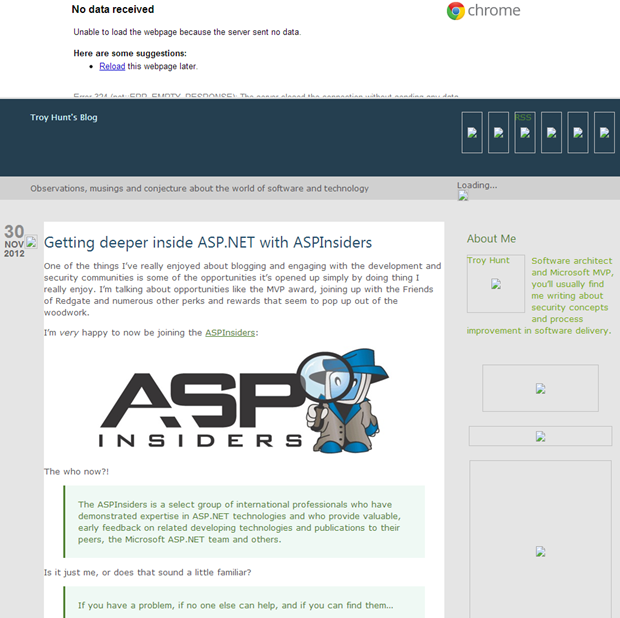
This is broken on many levels but it’s ultimately only due to one thing; China blocks blogspot.com and that’s where the template images and various other script files were located. Contrast this with the new version:
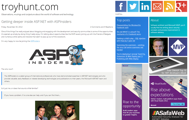
The only thing that doesn’t load now is the search box which is a whole lot better than having a fundamentally broken page. This is all simply because I’m now hosting the template images and CSS over on AppHarbor under the troyhuntblog.apphb.com domain which so far, the Chinese haven’t taken a disliking to. Mind you, history has shown they
Making it better
A few years, in retrospect, was way too long to go without making significant improvements so the trick now is not to let that happen again. In fact as it is, I’m not happy with some spacing and a few other little design artefacts but fortunately that’s all just trimming around the edges now.
Feedback, people – hit me with the good, the bad and the ugly. Where can I tune, refine and optimise? Does my SEO totally suck? Have I missed an elephant in the room?
But seriously, feedback is great so do please keep it coming.