Been a lot of "victim blaming" going on these last few days. The victim, through no fault of their own, has been the target of numerous angry tweets designed to ridicule their role in internet security and suggest they are incapable of performing their duty. Here's where it all started:
This is a great example of how bad people are at reading and understanding even the domain part of the URL then making decisions based on that which affect their security and privacy (see the answer under the poll) https://t.co/Ati2ndKvGI
— Troy Hunt (@troyhunt) October 24, 2020
Let me include a screen grab of the poll NordVPN posted in that tweet because for reasons that will become apparent in a moment, your experience may differ:
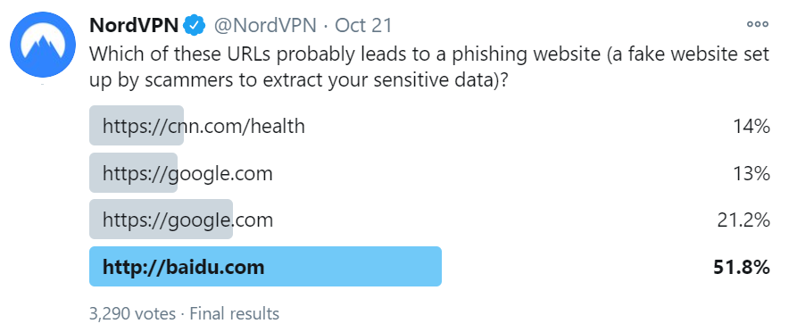
When I first saw this poll, it had already ended so the votes were on full display. I assumed Baidu got the lion's share of the votes by virtue of the HTTP address not being served over the secure scheme, even though HTTPS has got absolutely nothing to do with the trustworthiness of the contents of a website. If I'm completely honest, I had no idea what the correct answer would be because frankly, I'm bad at reading URLs. Turns out it was the third one:
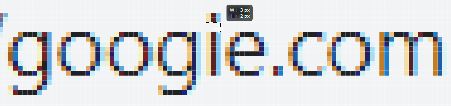
The answer is number 3. We used an upper-case “i” to make it look like a lower-case “L” I or l — not so easy to spot the difference, is it? That’s how https://t.co/IxZMKl9zcO became https://t.co/bLOVrYNV1u.
— NordVPN (@NordVPN) October 23, 2020
Ah, tricky! Everything becomes clear(er) if I manually change the font in the browser dev tools to a serif version:
The victim I was referring to in the opening of this blog post? The poor old sans-serif font with multiple people throwing it under the proverbial bus as a useless typographic choice for expressing domain names. I'm going to come to the defence of the simple typeface in this blog, starting with an explanation of what we're actually seeing here - homoglyphs:
In orthography and typography, a homoglyph is one of two or more graphemes, characters, or glyphs with shapes that appear identical or very similar.
But the characters in NordVPN's poll only appear similar because the case is being mixed, so why not just lowercase everything? That's what happens already once the URL appears in the browser's address bar:
Wait, don't browsers always do .toLowerCase() on URLs in the navbar, after they are resolved & loaded? (DNSes are case-insensitive).
— Bartek Świerczyński (@bswierczynski) October 25, 2020
That would show the issue with "googie".
Eyeballing an URL-link before clicking is not too helpful as link text can be different than target URL.
For the domain NordVPN used in the poll, let's have a look at how it renders in the browser (oddly, the site doesn't support HTTPS so I've changed the scheme, but the domain name is the same):

Turns out that googie.com isn't a phishing website, rather it's a legit real estate services business, shown here in Chrome at the very common resolution of 1080p. Can you spot the subtle difference in the domain name compared to the search engine? Can you clearly see how the "i" is not an "l"? Obviously, the image is resized to the width of paragraphs on this blog, give it a click if you want to check it out at 1:1 size. But let's also keep some perspective here; look at how many pixels are different between an "i" and an "l":
Are we really saying we're going to combat phishing by relying on untrained eyes to spot 6 pixels being off in a screen of more than 2 million of them?! Of course not, especially if someone has just arrived at this page after clicking on a link like NordVPN's with the uppercase "I" and especially not if instead of a "fine real estate" website the page was a phish designed to look precisely like Google. Bartek's suggestion was entirely understandable, but also entirely unreliable.
Much of this comes back to the old chestnut about how involved users should be in the whole decision-making process around the trustworthiness of a URL and indeed, how proactive technology should be to help them with this task. For example:
For a long time, I've thought URLs should always be rendered with serifs, partially for this exact reason. That and slashed zeros, and maybe a warning popup for URLs visually similar to (but different from) popular ones, would go a long way to mitigate it
— Jon (@heeerrresjonny) October 25, 2020
So... someone wants to look for some fine real estate on googie.com and the browser pops a warning? Poor Googie! Just having a similar name doesn't make a site "bad" (or potentially bad) in just the same way as not having a similar name doesn't mean the URL isn't pointing at a phishing site. More on that soon.
But there's another problem too and it boils down to the fact that homoglyphs are a much broader issue than a couple of characters in sans-serif appearing similar. For example, the Wikipedia article on the topic demonstrates how the first letter of our Latin alphabet expressed in lowercase is indistinguishable from a Cyrillic version when expressed in the Helvetica font:
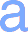
The blue in-fill is the familiar "a" whilst the red outline is the Cyrillic one and whilst these two characters look the same, they're actually totally different. Consequently, you could feasibly have two different URLs expressed that whilst visually identical, actually go to different places. Here's a beautiful illustration of the problem:
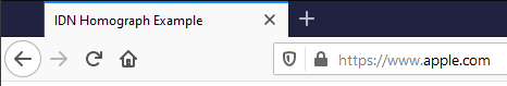
If you look at the address bar in the current version of Firefox, your eyes tell you you're looking at apple.com yet if you look at the title of the tab, you realise you're not on the tech giant's website at all rather you're on аррӏе.com instead. Huh?!
Now let's get really messed up and inspect the paragraph above in Firefox's dev tools:
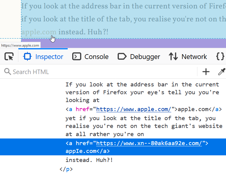
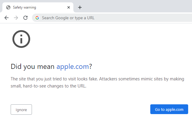
The browser shows the company name we all recognise on the page and just under the mouse we see the same name again in the status bar. Yet in the dev tools we see the href attribute of the hyperlink referring to an unrecognisable string of characters and the domain name within the <a> tag almost looking like a very familiar one, albeit for the fourth character. Click the link on Firefox and you end up on a page talking about IDN homographs but if you're on Chrome, the experience is different; it still looks like the tech company's domain in the browser but hovering over the link shows the href value from above in the status bar. Actually clicking the link then gives you this:
This is a demonstration from April 2017 of phishing with Unicode domains:
Visually, the two domains are indistinguishable due to the font used by Chrome and Firefox. As a result, it becomes impossible to identify the site as fraudulent without carefully inspecting the site's URL or SSL certificate
You can delve into the details of how this works in the link above but for now, there's two important messages to take away with you:
- Even careful visual inspection of the URL is insufficient to determine the actual website address you're visiting
- Different clients can render precisely the same URL in completely different ways
This is why sentiments such as this are so misplaced:
Victim-blaming people for typographers’ and coders’ sins. ¯\_(ツ)_/¯ https://t.co/SuFE5g9hCh
— Mark Simmons (@MarkDSimmons) October 25, 2020
This is not a "sin" committed by either typographers or coders and blaming the poor old sans-serif font merely makes it the victim in all of this. It's a misplaced sentiment as we simply have similar looking characters in different alphabets. Is it any wonder that people are bad at reading and understanding even the domain part of the URL then making decisions based on that which affect their security and privacy?
What if we took a different tact? I mean what if we somehow made it much clearer to people the actual URL they're on in a way that isn't ambiguous due to the characters used in the address? Be more "user-centric", as it were:
Empathy and user-centred design. Design for the users we have, not the users we want. Centre their experience, not ours. Create lots of feedback loops, and use them intelligently. Oh, and no sneering at people who have niche needs, or prefer unusual approaches. The end.
— Emma (@Browwwn) October 25, 2020
Let's tackle why this doesn't get us any closer to a real solution and this is where things gets worse - much worse. Before you start watching the video I've embedded below, let me set some context: this talk is by Emily Schechter who works on the Google Chrome team. I saw her deliver this keynote at LocoMocoSec in Hawaii a couple of years ago and it really resonated with me. Emily is one of the best in the business with more access to real world information on how people interact with browsers than just about anyone, so listen to her words carefully (I've deep-linked to the relevant section, just give it one minute of your time):
Do you think you can understand just from the URL who's publishing these sites? Can you tell which one of these is the real Google blog site?
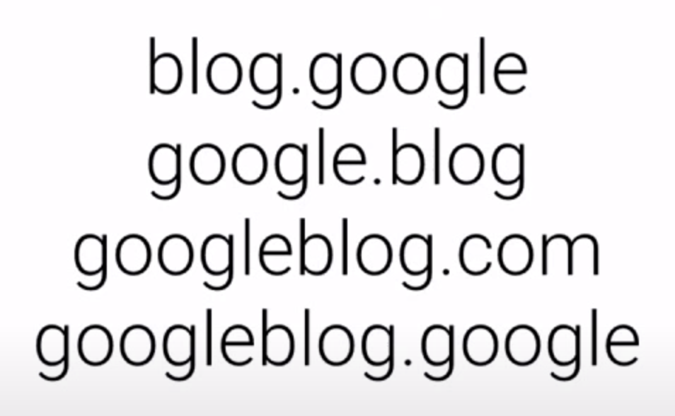
I can't, because as we've already established, I'm bad at reading and understanding even the domain part of the URL, just like you are. In case you were wondering, the real Google blog website is at blog.google and the only way I know that is because I fast forwarded to the 16 minute mark of the video and heard Emily say that! The point I'm obviously making here is that when we talk about people being bad at interpreting URLs, it's not a problem that's solved simply by changing the font or "centring their experience", the issue is so much deeper than that.
But none of that stopped the Twitter peanut gallery from chiming in on their displeasure about difficulties that URLs pose. Some suggestions were reasonable, others were, well:
Yet another "blame the end user" post.
— Earl Matthews (@EarlMatthews) October 25, 2020
Systems need to be designed to be accessible to *everyone*
If I have to do special mental or physical gymnastics to use a system... THE SYSTEM IS BROKEN https://t.co/iZIPj5ZMu7
A common theme amongst the responses on Twitter was about user-centricity, empathy and accessibility. These are all good sentiments, but as I said in a follow-up tweet, they're all motherhood statements that carry nothing of substance. It's akin to saying "we should solve world hunger" then wandering off without actually providing any solutions. Or saying something like we should just have a "funded multi-disciplinary team" and that'll solve the probl... ah:
"What can we build to achieve that?" a funded multi-disciplinary team who can obtain non-anecdotal data and ultimately influence priorities at standards panels and with vendors?
— Joel Samuel (@JoelGSamuel) October 26, 2020
Tech will only go so far, but Safe Browsing and known-bad RPZ into consumer DNS as well (probably)
I'm sure it'd be very nice to have this team, but what are they actually going to build? Is it a button? A notification somewhere? This isn't a solution to phishing, it's suggesting that there should be a team of people who can find solutions to phishing, kinda like the Google Chrome team, right? 🙂
A suggestion that was more practical in nature involved displaying some form of verified identity on the site:
Yeah, if SMS/Twitter clients highlight the URLs, perhaps they should normalize them via .toLowerCase() as well.
— Bartek Świerczyński (@bswierczynski) October 26, 2020
What's the solution here? Displaying company's (trademarked) logo next to the authentic URL, defined in a special registry?
Browsers used to do that for certificates.
Whilst this sounds good in theory, as Bartek observed, browsers don't do that anymore and for good reason: it never worked in the first place. It never worked for all the sorts of reasons I outlined in that blog post and the others that preceded it. At the very heart of EV's failure was this simple false premise: that on a per website basis, users are able to use their own judgement to accurately make a trust decision based on the absence of a little-known (and rarely present) visual indicator. They couldn't, just as they can't with URL parameters, fonts with or without serifs and indeed even entire URLs without any obfuscation whatsoever. It. Just. Doesn't. Work.
But what if they could? I mean what if the world was completely different to what it actually is and people understood visual security indicators? Not just visual indicators, what if people could actually read and understand URLs?
I think hiding information will deprive users of key chances at detecting anomalous situations. I really do. Clarifying and amplifying would be my preference.
— Mark Simmons (@MarkDSimmons) October 25, 2020
Clearly, they can't at present (we've already established that), so what would be the challenges in changing this behaviour?
First of all that places the burden on the user. Second, education like that has never worked before. Third, literally billions of people will need teaching. Expecting users to be enough of a security expert to do this reliably and accurately isn't going to happen.
— Scott Helme (@Scott_Helme) October 25, 2020
Scott nailed it here - changing the status quo across billions of internet users simply isn't feasible and any solution that requires them to detect subtle nuances in the structure of a URL is bound to fail. There are places where visual indicators can be very effective, but we're talking really obnoxious ones such as Chrome's warning above on the punycode Apple domain. That's a very different kettle of phish (sorry, couldn't help myself!) to suggesting that we can train people to read and understand URLs.
So, can we just take the humans out of the picture and instead identify phishing sites with the technology? We can already and last month I wrote about how NordVPN's CyberSec can block this sort of thing outright:
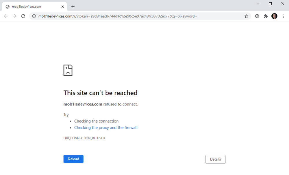
Per that blog post, this was a legitimate phishing site (ok, I used the word "legitimate" in an odd fashion here but you know what I mean 🙂), and check out the URL; none of the prior suggestions around using a serif font stop sites like this. Does anyone honestly think less people would fall for it if the font was more decorative?!
Before wrapping up this post, it's worth touching on why we have sans-serif fonts in places like Twitter clients. In fact, let's first acknowledge that unless someone can prove me wrong, every Twitter client uses a sans-serif font. Certainly, the Twitter website does, so does the native iOS client and so does Tweetbot. If you're using a client that doesn't, I'd love to know about it. Now, do you think it's just coincidence that things worked out that way? Are coders "sinners" for building the clients using these fonts or might there actually be a legitimate reason why? Of course it's the latter:
Sans-serif fonts tend to have less stroke width variation than serif fonts. They are often used to convey simplicity and modernity or minimalism. Sans-serif fonts have become the most prevalent for display of text on computer screens. On lower-resolution digital displays, fine details like serifs may disappear or appear too large.
That said, I've obviously taken a different approach with this blog but I'm also not trying to condense as much information into a small space as what Twitter is. Regardless, a sans-serif font is no more a "sin" than a serif font would stop phishing so no, I can't see Twitter clients changing tact and it would make very little difference anyway.
So, what's the answer? I mean the actual solution rather than just, say, recontextualising killer networks. (Ok, so I took that from the bullshit generator but it's indistinguishable from some of suggestions referenced earlier.) Turns out we do have solutions and as several people pointed out, using a decent password manager is one of them:
Solution: use 1password as your password manager. It won't match the faked domain, hence no password gets entered. That's why Troy recommends password managers. Specifically #1password 👍
— MarcG (@marcwastaken) October 25, 2020
Want to make a meaningful difference to phishing attacks? Stop whinging about fonts and instead get people using an up to date browser that flags known phishing sites running through NordVPN with CyberSec turned on and authenticating to websites using 1Password. Keep educating people, by all means, but expect even the savviest internet users will ultimately be as bad at reading URLs as I am 🙂